
 Louder AAA


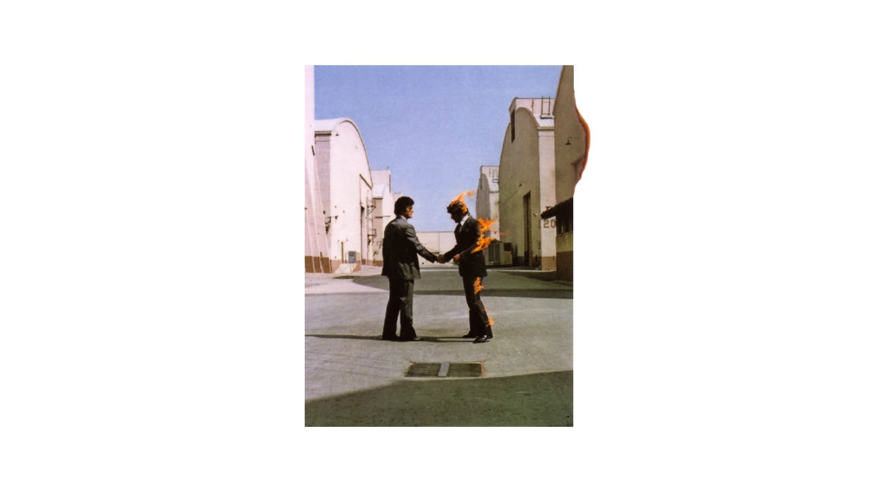
Their music was complex and challenging, and Pink Floyd treated each album sleeve as an extension of their musical artistry. And it’s arguable that the artwork for Wish You Were Here is the best example of that approach.
According to its designer Aubrey Powell, the whole concept of the images is “based on the band’s relationship with major businesses in general, and their record label in particular” and it’s not exactly a welcoming one.
The two men photographed on the front cover (both film stuntmen, incidentally) represent one person getting burned by doing a business deal with the other.
- Every Pink Floyd Album, Ranked From Worst to Best
- Why I love Pink Floyd's Piper At The Gates Of Dawn, by Chris Cornell
- Pink Floyd's Descent Into Madness
- How Wish You Were Here was the beginning of the end for Pink Floyd
The back cover has an invisible man in a business suit, representing someone who might be trying to sell you a record. But “you don’t know exactly who he really is – this is just an invisible salesman selling you ‘a product’.”
The other iconic image is that of a diver hitting the water, which, Powell says, is meant to be the band dealing with all the nonsense of the music industry: “It simply states that any artist or musician can be as powerful as they wish, and create as many – or as few – waves as you want.”
The photo was taken using a stuntman as the diver, in the Sierra Mountains of California. The diver in question could hold his breath for two minutes which importantly meant that he didn’t have to come up quickly, and disturb the ripples on the surface.
Also in this montage of images and imagery is a photo of a veil, as worn at a funeral, which is meant to represent the absence of someone close.
The album was wrapped in black plastic, with just a sticker – of two mechanical hands shaking – on the front, revising the theme of the actual front cover.

Powell recalls that the record label (Harvest/EMI) were not best pleased with this idea – the album title was on the sticker, but the band’s name wasn’t. “They went mad,” Powell remembers, “but we were determined to have it our way. We saw it as building up the anticipation and surprise by buying something that’s hidden.”
The circular sticker – which was also used in the design of the record’s label – was split into four quadrants, representing the four elements: earth, fire, air and water. This was a reflection of all the images used throughout.
