“It was loosely based on a character who’d rant at passers-by in the market square. I squidged a Polaroid, added running make-up and a cockade hat. Bish bosh, I had a jester!” How Mark Wilkinson’s artistic genius helped define Marillion’s image
With the Market Square Heroes sleeve acting as a successful audition, his partnership with the neo-prog icons meant he joined them in being free to create whatever art they wanted to
Sign up below to get the latest from Prog, plus exclusive special offers, direct to your inbox!
You are now subscribed
Your newsletter sign-up was successful
Want to add more newsletters?
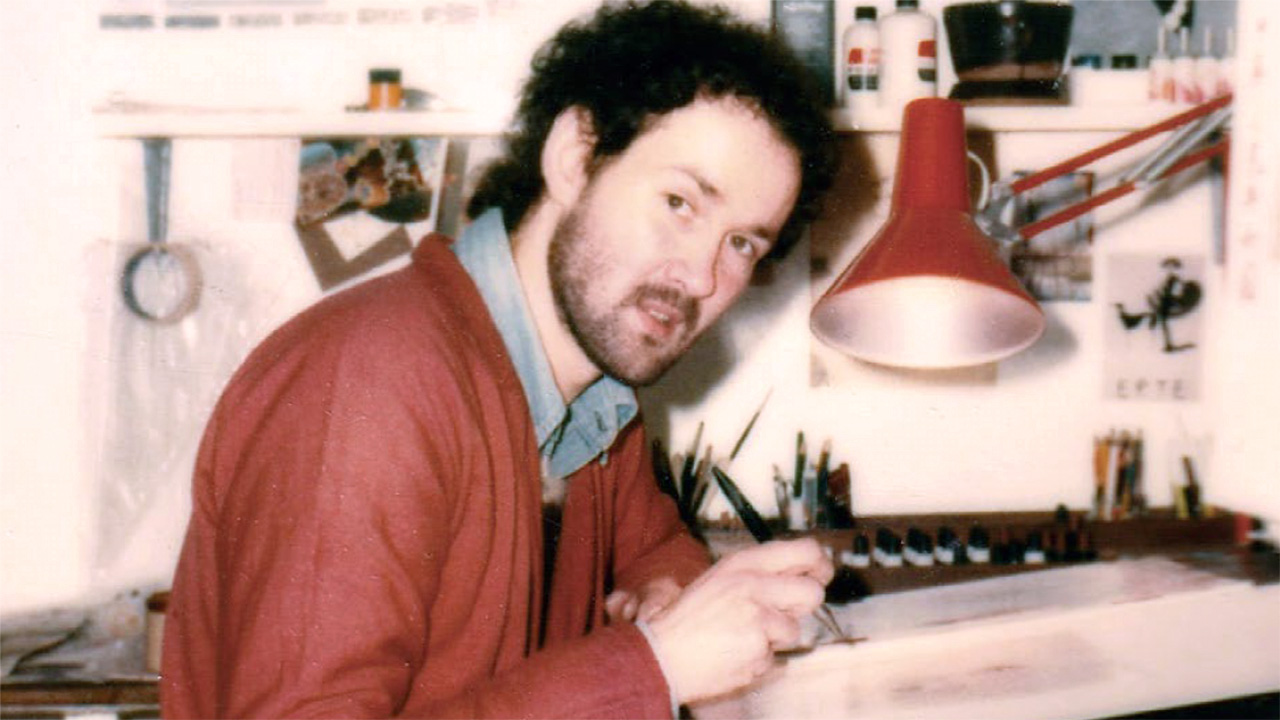
Mark Wilkinson’s vibrant art has been synonymous with Marillion since their debut single. In 2019 he spoke to Prog about creating the manic jester that helped launch his career in the 80s.
In 1982, Mark Wilkinson had been a freelance illustrator for four years after completing art college. Working primarily on book covers, early computer game promotional art and portraiture, he harboured a strong desire to get into the world of album covers, inspired by the likes of Mati Klarwein, who painted Miles Davis’ Bitches Brew and Santana’s Abraxas, among others.
Wilkinson was fully immersed in the wild, wonderful sights and sounds of prog, krautrock and artful post-punk when opportunity came knocking. “Jo Mirowski at Torchlight Studios had been given the brief for designing the early singles and first album for Marillion by his regular client EMI Records.
Article continues below“He was looking for a new artist – someone unknown in the field of album cover art. He thought it would be more interesting to do that than use someone who was more established. But it was a risk, and he knew it.”
The young Wilkinson’s first job for Marillion was to create a cover for debut single Market Square Heroes. Essentially it was an audition: if he delivered the goods, he’d be first in line for a more permanent role.
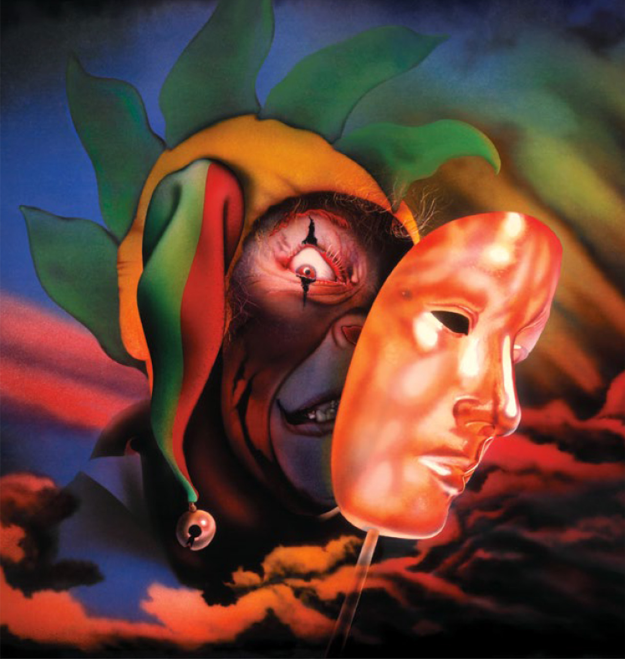
“I had yet to meet the band when Jo called me into his studio for the brief,” he recalls. “I took notes. They wanted a jester; it related to a poem Fish had written called The Crying Jester, I believe, but it was also loosely based on a character called Brick, who’d rant loudly at passers-by in the Market Square in Aylesbury, where the band lived.
“For the first image they wanted to hide him slightly, so he could be fully revealed on the next single and album; so a mask was suggested. Also, the Eye Of Horus had been an early visual symbol for the band on backdrops and t-shirts. I squidged a developing Polaroid of my own eye for reference, added running kohl eye make-up, plonked a cockade hat on his head and, bish bosh, I had a jester!”
Sign up below to get the latest from Prog, plus exclusive special offers, direct to your inbox!
As Marillion’s popularity began to increase at a startling rate, Wilkinson found himself employed officially by the band, who were extremely pleased with both the Market Square Heroes sleeve and the subsequent He Knows You Know piece where the jester bursts through his mask to dramatic effect.
His next job was the big one – the cover for Marillion’s debut album, Script For A Jester’s Tear. “Fish took out a piece of paper with ideas he’d jotted down. The jester was to be in a seedy bedsit, with a sense of urban decay: mouldy walls, spider webs, a filthy mattress on bare boards.
“He’s playing an instrument while struggling to write a lyric. Somebody suggested a violin, rather than a guitar or piano. They also talked about having a chameleon in the mix. Looking back at it now, I suppose it was a defiant statement – visually at odds with the times.”
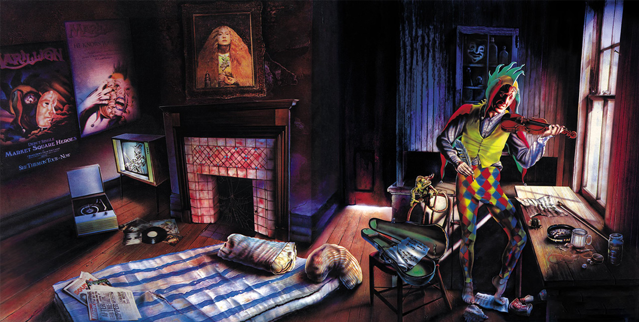
Although he’d followed Marillion’s progress from the very beginning, Wilkinson admits he was unaware that the band were teetering on the brink of mainstream success as they launched the album. “I wanted to create something that I’d be proud of for my first cover. I hoped Script would stand out in the record racks and get noticed.
“But their success totally surprised me. I saw them rise up very fast and totally confound their critics through sheer hard work and inventiveness. In turn, my own career flourished.”
As Marillion surged forward, Wilkinson had to maintain his own creative momentum. For second album Fugazi in 1984, the jester appears amid yet more cryptic detail and mystery. Despite its bright colours and modernist sheen, the art clearly indicated that Fish’s lyrical (and perhaps personal) world was getting darker and weirder.
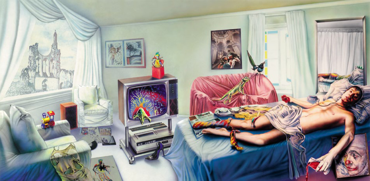
“I intentionally made Fugazi much brighter in tone. I wanted to create a visual counterpoint to Script,” says Wilkinson. “‘A clean acid trip’ was what Fish said when he first saw it!
“But I don’t really know what’s going on. I mean, I painted it, so I should, but it confuses me even now! There was much talk about Vietnam in general, and Apocalypse Now in particular, when we met to discuss it: The Heart of Darkness, incubi, nightmare demons and sex.”
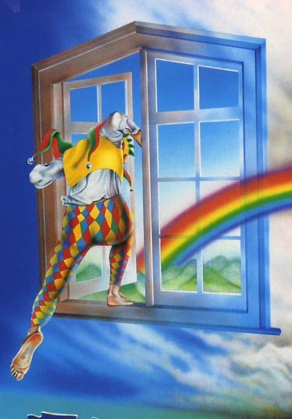
Having established himself as integral to Marillion’s holistic approach to music, Wilkinson continued to work with the band up until Fish’s departure in 1988. The jester made a few more appearances along the way, most notably escaping through a window on the back cover of Misplaced Childhood.
You can also see the corner of his cockade hat peeking out from Torch’s pocket on the Clutching At Straws sleeve.
But for Wilkinson, the jester was something more than just a handy metaphorical device for a passionate young band. “The jester represents freedom,” he explains. “My work before him was tied to the visions of authors, art directors, agents and salesmen. I was a gun for hire.
“After Script For A Jester’s Tear, that all changed. People came to me for ideas as well as pictures. For that alone I will always be grateful.”

Dom Lawson began his inauspicious career as a music journalist in 1999. He wrote for Kerrang! for seven years, before moving to Metal Hammer and Prog Magazine in 2007. His primary interests are heavy metal, progressive rock, coffee, snooker and despair. He is politically homeless and has an excellent beard.
You must confirm your public display name before commenting
Please logout and then login again, you will then be prompted to enter your display name.
