
 Louder AAA


Never let anyone tell you that Mötley Crüe didn’t understand the concept of excess. Dr Feelgood was the biggest album of the Crüe’s career, and more than half-a-million dollars was spent on making it. Produced by Bob Rock, it also features guest appearances from members of Aerosmith, Cheap Trick and Skid Row, plus Bryan Adams.
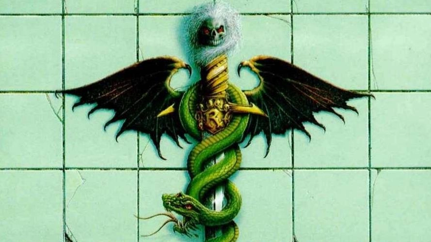
The album sleeve offered something a little different to anything the band had done before. In fact, it has to be admitted that, apart from the slightly esoteric inference of the masks on 1985’s Theatre Of Pain, the band’s artwork was downright shoddy. But this time, they put a little more thought into the approach.
- The Top 10 Best Motley Crue Songs
- Motley Crue will be in your life for a long time, says Nikki Sixx
- The Bizarre Life & Sad Death Of Nikki Sixx’s Doppelganger
- Piss bottles and cow eyes: Motley Crue remember 1984
“It was us who came up with the idea for the sleeve,” recalls bassist Nikki Sixx. “We just wanted something a little different to what had been on our covers before.”
The original concept for the sleeve was to have a drawing of Allister Fiend as a crazed doctor holding onto a big syringe. Fiend is the dyspeptic character created at the time of the Shout At The Devil album in 1983, and narrates the spoken-word piece called In The Beginning which kickstarts the record. The theory was the subversive Fiend could become the Mötley Crüe equivalent of Iron Maiden’s Eddie.
So why did the Fiend fail to make the grade for the cover of Dr Feelgood?
“I can’t recall now why we dropped the idea. All those drugs have taken their toll on my memory,” laughs the bassist. One theory put forward at the time was that the notion of Allister Fiend holding a syringe was just a little too close to home especially for Nikki Sixx, who was struggling with heroin addiction.

Whatever the truth for the switch, it was decided that famed tattooist Kevin Brady, then working at Sunset Strip Tattoo Parlour in LA – should be brought in to do the artwork alongside an illustration by Master Of Puppets artist Don Brautigam.
“Kevin had tattooed us for a while, as well as others on the scene, like Ozzy, Billy Idol and Sean Penn,” Sixx says. “He was very talented, so why not? It seemed like a good choice – and it worked out very well.”
The design – a rock version of the caduceus, which is used as a symbol of medicine in the US – quickly became an iconic image. Brady also overhauled the band’s logo, giving it a more contemporary feel for the late 80s.
After the record hit number one in the US, the Sunset Strip Tattoo Parlour was apparently swamped by fans, who mistakenly believed that the band actually lived there. Where would they sleep?
