
 Louder AAA


This article originally appeared in Prog issue 27
The music may have been the epitome of overblown to some, but Roger Dean’s iconic work rates as some of his finest.

YES - TALES FROM TOPOGRAPHIC OCEANS
(Atlantic, 1973)
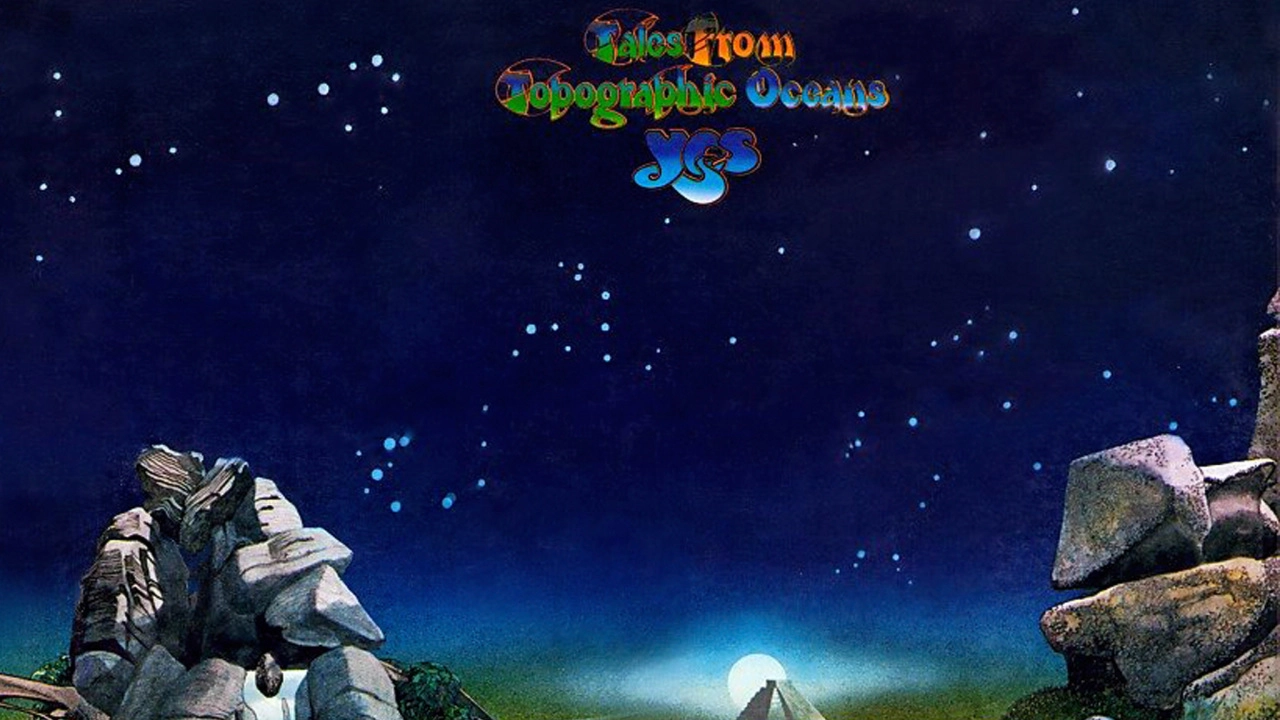
Although Roger Dean had created sleeves for a number of other bands during the late sixties, it was his collaborations with Yes which brought his other-worldly designs to the fore and became a crucial element in the packaging of that band’s early seventies releases. Having already designed the covers that adorned Fragile and Close To The Edge, as well as creating their iconic “bubble” logo, in 1973 he was approached to craft the sleeve for their double album Tales From Topographic Oceans. The album’s reception was mixed due to the complexity of the tracks, but the sleeve still remains one of the band’s more recognisable.


How did you meet the band?
“Well I remember meeting Phil Carson, who was running Atlantic records in Europe at the time, and showing him some of my work. Phil told me that he’d love me to do a cover for them but he only had two bands on the roster, which were Yes and Led Zeppelin. As soon as one of them needed a new cover he said he’d give me a call, and the Yes sleeve came up first. So that was how I was initially introduced to the band. It was all fairly prosaic really, so there weren’t any mystical meetings on a mountain.”

What about the design brief?
“It was different with regard to any other Yes album cover I’ve done as it involved a long and detailed conversation with Jon Anderson. On other occasions the expectation was that it was my job to come up with the idea, develop it, present it and package it. So for Fragile for example, around that time I was concerned with the problems of pollution, plus I wanted to create something to match the title. So the idea was to have a small, fragile world as a centrepiece and the spaceship was an ark taking the inhabitants and whatever creatures there were on this planet to a new home. The planet then begins to disintegrate in view of the craft and this is shown on the back cover. But for Tales From Topographic Oceans I remember Jon and I spent a long time talking about ideas for the sleeve when we were flying from London to Tokyo via Alaska, and we were just inspired when looking at the patterns in the landscapes below.”
- Roger Dean: How I designed the Yes classic Close To The Edge
- Anderson Rabin Wakeman to record next year
- Yes: The Real Story Behind Tales From Topographic Oceans
- What does the prog world really think of Yes' Tales From Topographic Oceans?
The cover was more landscape oriented compared to previous works. What was the reason behind that?
“Well, landscapes have always been my inspiration and I still primarily think of myself as a landscape painter. Tales… was really me trying to convey my enthusiasm for landscapes and Jon seemed to have a matching interest.”
What were the inspirations behind each of the stones or monuments?
“Well, nothing in that sleeve is actually made up or imagined, so everything that’s in there is a portrait of something. The Mayan Temple is the most obvious one but all the other rocks exist. The rock on the left hand side is at Avebury and continually pops up in magazines. The fascinating thing about it is that every photo that I’ve seen of it has been taken from exactly the same view that I drew it. The waterfall and pile of rocks are at Brimham Rocks in Yorkshire, and there are others rocks that are at Stonehenge and Land’s End. So every stone in that picture I could take you to.”
- - - - - -
Yes Fragile Album Quiz: how well do you know their fourth studio album?
