The story behind every Slipknot album cover
From the masked maniac look of their debut to the kaleidoscopic The End, So Far, this is the definitive story behind every Slipknot album cover
Select the newsletters you’d like to receive. Then, add your email to sign up.
You are now subscribed
Your newsletter sign-up was successful
Want to add more newsletters?
.5: The Gray Chapter (2014)

The spectre hanging over Slipknot’s first album in six years was, as is obvious by its title, the death of Paul Gray. The pig-masked Californian wasn’t just the band’s bassist, but also a co-founder and principal songwriter. It cast a black cloud that lingered for years.
“[The Gray Chapter] really is the story of the last four years,” Corey said in 2014. “There’s a lot of pain, guilt and reflection. There’s a lot of good stuff and a lot of accusatory anger, whether it’s pointed outward or inward.”
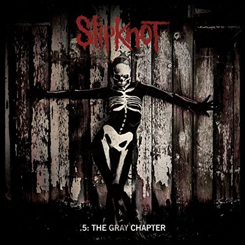
The band complimented the album’s remorseful, macabre overtones with a cover depicting a skeletal figure in a crucifixion pose against a wooden fence. In October 2019, Clown shared an alternate version of the artwork that was a leading candidate to be the Gray Chapter cover, but was cast aside for undisclosed reasons. The same skeleton is the heart of the piece, although they’re against a shadowy backdrop and have a pattern resembling angelic wings projected onto them.
Article continues below“This cover was a strong contender for the final album artwork, and represents where my head was at during the making of this album,” Clown wrote on Instagram. Dare we say, it’s better than the final version.
A post shared by Slipknot (@slipknot)
A photo posted by on
We Are Not Your Kind (2019)

Initially, the vision for Slipknot’s sixth album was that it was going to be the Iowans’ art rock moment. Clown told BBC Radio 1 in June 2015: “We’ve gotta write our Wall, Sgt Pepper, whatever you wanna say. […] I'd love it if we could do a double album, have a concept, maybe make a movie.”
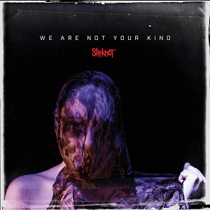
We Are Not Your Kind didn’t end up being quite that ambitious when it came out in August 2019, but the art rock weirdness is alive and well on its front cover. It shows a woman in front of a jet black background, with her head under a veil to make her face indistinguishable. Similar figures had just been seen in the video for lead single Unsainted, depicted singing the track’s choir backing vocals.
No one knows what Slipknot were going for with this piece, but it’s a strong complement to the album’s title. If screaming We Are Not Your Kind was Slipknot’s way of flaunting how unpredictable and scary they are, then a cover model that we know nothing about and can’t even see the face of is a good visual accompaniment.
Sign up below to get the latest from Metal Hammer, plus exclusive special offers, direct to your inbox!
The End, So Far (2022)

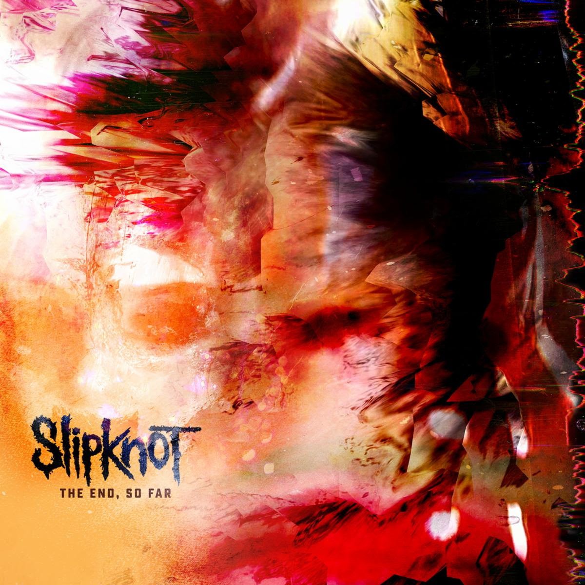
Frankly, your guess is as good as ours. The cover of Slipknot’s final album for Roadrunner Records is by far the most abstract piece that the band have ever used: a contorting mass of orange that grows blacker and messier towards the top-right corner.
There’s been plenty of speculation as to what the fuck is going on with the cover for The End, So Far. Some fans have posited that the artwork is a distorted closeup of the cover of The Chapeltown Rag, which was released as The End, So Far’s lead single in November 2021. Would there be any deeper meaning if that were the case? Probably not – but it looks cool.
The art features the tried and tested Slipknot logo in the bottom-left corner, which has been displayed on their every album cover apart from All Hope Is Gone. Interestingly enough, on Iowa, Joey Jordison is credited with designing the logo, as well as that “tribal S” that would launch a million tattoos.
The drummer was sadly dismissed from the band in 2013 for “personal reasons”. He revealed to Hammer in 2016 that he had been suffering from acute transverse myelitis since 2010 – a neurological disease that left him temporarily unable to drum – then tragically passed away in 2021.
- 1
- 2
Current page: The Story Behind Every Slipknot Album Cover: They Gray Chapter (2014) to The End, So Far (2022)
Prev Page The Story Behind Every Slipknot Album Cover: Slipknot (1999) to All Hope Is Gone (2008)
Louder’s resident Gojira obsessive was still at uni when he joined the team in 2017. Since then, Matt’s become a regular in Metal Hammer and Prog, at his happiest when interviewing the most forward-thinking artists heavy music can muster. He’s got bylines in The Guardian, The Telegraph, The Independent, NME and many others, too. When he’s not writing, you’ll probably find him skydiving, scuba diving or coasteering.
