
 Louder AAA


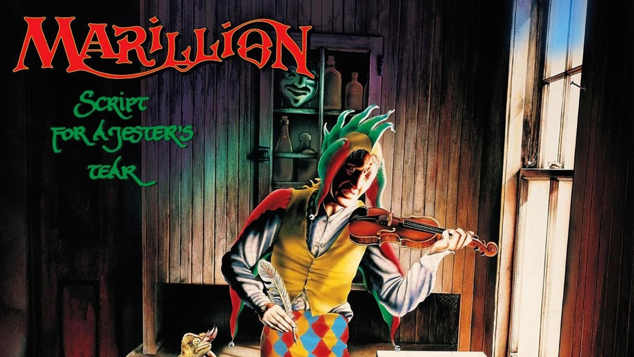
Mark Wilkinson reveals the secrets behind Marillion’s debut album cover
SCRIPT FOR A JESTER’S TEAR - MARILLION
(EMI, 1983)
Marillion’s debut album, Script For A Jester’s Tear really marked the rejuvenation of prog rock, introducing a young generation of talent. Regarded as the pre-eminent force of this neo prog movement, Marillion had already made an impact the previous year with the single Market Square Heroes. Now, they solidified their growing reputation through songs like He Knows You Know, Chelsea Monday and Garden Party. The album reached number seven in the UK chart and set the tone for increasing success during the next few years. Mark Wilkinson’s artwork was not only detailed and erudite, but introduced the recognisable figure of The Jester.

How did you meet the band?
“Totally by accident. People I shared a flat with in Penge, South London, were drinking in a pub one night and overheard that a design company called Torchlight were looking for a new artist to work with a band who just signed to EMI. They told me about, it and I called Jo Mirowski from the company the next day. I went in and showed him my portfolio, and as a result got the chance to meet Marillion. I was told initially I would only be working with them on their early singles, but they liked my work enough to ask me to do the album sleeve.”
How did you come up with the idea?
“It was Fish’s idea. He wanted to portray a down at heel writer and his surroundings. I took it on from there.”
Had you heard the music beforehand (and what did you think)?
“Not a note. Nothing. I had no clue how it would sound. So, there’s nothing of the music in what you see.”

What was the concept?
“Fish had wanted the struggling writer on the sleeve to look like a jester, because he’d had this notion for the figure even before Marillion were formed. So, that’s the why the central character looks the way he does, But I then took on the idea of the struggling writer and set him in a bedsit surrounded by lots of objects to portray that sort of existence. Therefore, you do have crumpled pieces of paper on the floor, and there’s a real sense of a seedy environment. I actually painting my own place in Penge, so a lot of what you see reflects my situation at the time.”

What’s the story behind the record sleeves, magazines and posters?
“There are copies of Kerrang!, Sounds and the Daily Mirror on the floor, because I thought those were the sort of things our ‘hero’ would read. The Mirror has a story about the Yorkshire Ripper on the front page.
“There are sheets on music lying around, but with nothing identifiable on them. That’s because we could have been sued for breach of copyright. And the music posters are, of course, from earlier Marillion releases. The records on the floor are the two Marillion singles, plus the albums A Saucerful Of Secrets from Pink Floyd and Bill Nelson’s Do You Dream In Colour?.
What about the painting over fire?
“The painting above the fireplace is called Ophelia, who is mentioned in Chelsea Monday. An early version of this featured John Lennon floating in water, my painting being based on Death Of Ophelia by 19th century painter Sir John Millais. But EMI asked I remove Lennon as use of his image had to be approved by Yoko and would have taken too long, so I replaced it just with Ophelia.
And what about the significance of the chameleon and the jester’s quill?
“The chameleon on the chair was inspired by a song the band had already written, but didn’t record until the Fugazi album [She Chameleon]. That’s also the case with the Punch figure on the TV screen [in reference to Punch And Judy].
“The quill the character is holding was done to reflect the fact that he was a writer, but I now can’t recall why I added in the violin. It was probably because I wanted him to have something music related in his other hand. The violin is actually my wife’s. You’ll notice that the lyrics inside the empty violin case are for The Beatles’ Yesterday. EMI got permission from Paul McCartney for those to be included.
“I wanted to have a Coca Cola can and a Fairy Liquid bottle in there, but was then asked to take out the references to these brands because it could cause problems. So, my first name is on the can and Jo’s name on the washing up bottle. For the same reason I removed the Fuller’s Brewery logo from the ashtray.”
What was the reaction?
“When I showed Jo Mirowski the finished cover, he said that the flat looked too clean, and asked I scuzz it up more. This was at 4pm on the day before the deadline delivery. So I had to pull an all nighter. Jo just told me, ‘Welcome to the music industry!’. No sympathy, ha!. So, I added more mould on the walls and scratches on the floor. That did the trick.
“Everyone loved the final cover. The band, the label, the management. People have been very kind about it over the years, and I know fans believe it to be an important part of the band’s history. Oh, and Paul McCartney was said to have been impressed. But I am still waiting for the call to work on one of his covers.”

