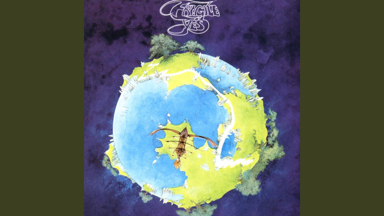
“The idea was to put a ‘fragile’ label on the album cover. I didn’t want to do anything so literal. I wanted to take the idea of fragility and wrap it round the world. Yes liked it and it worked”: The attitude behind Roger Dean’s album art
Inspired by real-life landscapes and knowing what he didn’t like, the forthright creator of remarkable worlds explains his partnership with Yes

Select the newsletters you’d like to receive. Then, add your email to sign up.
You are now subscribed
Your newsletter sign-up was successful
Want to add more newsletters?
Artist Roger Dean’s otherworldly visions have become synonymous with Yes – but his career to date includes many other collaborations. In 2020 he told Prog the stories behind some of his most iconic album covers, and revealed which of them Steve Howe has on his living room wall.
A young boy is climbing a steep hill at night. Carefully, he makes his way through the tangles of sparse scrub that cling to the side of Lion Rock; from his vantage point he can see Kowloon spread before him, the name of which comes from the term for nine dragons. Immediately below, the very last house of the accommodation reserved for British army personnel in Hong Kong – where he lives with his parents – huddles into the mane of Lion Rock. Beneath his feet time stands still, the passing of millions of years solidified in granite. Above him, a scattering of distant stars wink through the pearlescent glow of a moonlit night.
“It was just magical,” says Roger Dean, clearly moved by the memory of a night that, in all probability, lit within in him a desire to connect with both the built and natural environment. It’s a passion that remains undiminished to this day. Leaving behind Lion Rock and the nine dragons at the age of 14, he returned to the UK in the 1950s, when the country was still dealing with the privations of post-war austerity. He fondly remembers walking in the countryside as a child.
Article continues belowLater, as the 1960s got underway, he became a student at the Canterbury College Of Art; and later still, joined the Royal College Of Art. Every available minute that wasn’t engaged with filling sketchbooks was spent outdoors with friends. “We climbed all over Scotland and Wales,” he recalls. “I just loved pathways and landscapes. It was burned into my soul, if you like,” he recalls.
Dean’s work in turn has made its mark on countless music fans since the late 1960s. His visionary worlds – where magic, nature and retro-future technologies combine with a poetic yet unwritten epic narrative – have been adopted and exploited throughout elements of popular culture. For more than six decades his designs have been part of the cultural terrain through the covers of numerous albums and bands; the most important of which is Yes, beginning with 1971’s Fragile. His association has continued, with only a few interruptions, until the present day.
“If it had been up to me, I would never have let anybody else do sleeves for us,” says Yes’ Steve Howe. “But there were people in Yes at certain times who said, ‘We don’t want to go with Roger.’ I was like, ‘What?’ Well, we don’t do that any more. Roger is a loved, respected and admired friend.”
For the guitarist, Dean’s work is a kind of visual extension of a world they began terraforming soon after he joined Yes in 1970. It was important, he argues, to have their records dressed in imagery that reflected the ambitious sonic worlds they were attempting to create. “When we did The Yes Album, I mean, that sleeve is pretty lame, isn’t it? Everyone got used to it so now they kind of like it.”
Sign up below to get the latest from Prog, plus exclusive special offers, direct to your inbox!
When Dean showed up, Howe says the impact of his work upon the group was instantaneous. “We were like, ‘Now, that looks different.’ Our music has always been unusual, trying to do something distinctive, and we’re proud of that. But we’ve also lucked out with a guy who has something definitive going on as well. Roger gave our sleeves the wow factor. There’s always been a chemistry with him; he was touring with us last year and he’ll be with us this year.”
Dean has complete freedom to come up with whatever captures his imagination, says Howe. “Somebody might come forward with an idea and we’ll kick it about and Roger will listen. But he goes off and we don’t really have any idea what he’s going to come back with. Yes is so much part of his art direction; he’s closely involved with us.”
Then they asked me, ‘Where did you get the title?’ I said, ‘That’s the title you gave me.’ They said, ‘We gave you something totally different!’
Occasionally that closeness can get its wires crossed, says Dean, recalling the band’s perplexed reaction to his suggestion for 2014’s Heaven & Earth. “It’s not that they didn’t like it – rather that they were bemused. It quickly became clear to me that they weren’t looking at what they were expecting to be looking at!
“To me, the title Heaven & Earth is a partial quote from Hamlet, where he says: ‘There are more things in Heaven and Earth, Horatio, than are dreamt of in your philosophy.’ What I wanted to achieve was the idea of something massive and mysterious in some hidden place like the Arctic. Then they asked me, ‘Where did you get the title Heaven & Earth from?’ And I said, ‘That’s your title – that’s the title you gave me.’ And they said, ‘No we didn’t; we gave you something totally different!’
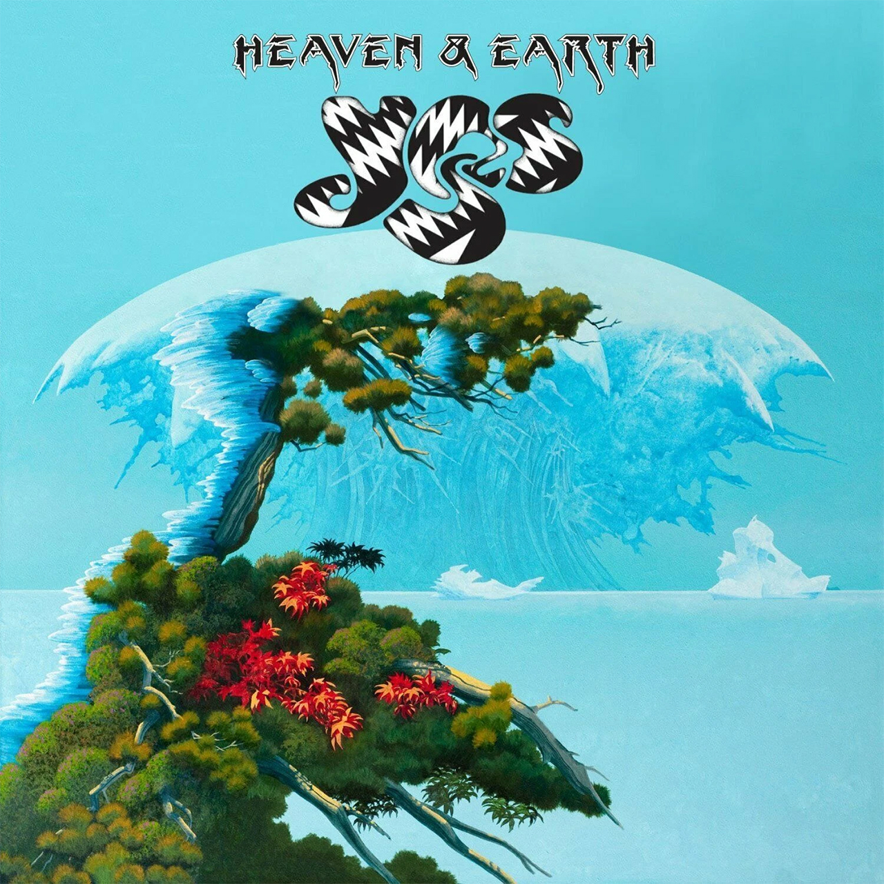
“They may well have given me something totally different. I got it over the phone and clearly I misheard, but it made enough sense to me that I went ahead with it. At the meeting, they were very bemused – but they said, ‘Well, let’s go with it!’”
To understand Dean and his unique vision, it’s important to know his long-standing ire at the rigours of conformity and modern design. When he studied industrial design at Canterbury, he wanted to switch to architecture but was profoundly unimpressed by the brutalist school of architecture’s dominance.
“Why on earth do we design things for people that are boxes? I was told I should read Le Corbusier’s The Modulor series. I read them and I thought, ‘What an astonishing load of bullshit!’ I used to tease architectural students – even now, when I teach, I say, ‘Architecture is a theology, a belief system with delusions of rationality.’ And I could say exactly the same about graphic design; this addiction to designs with fonts like Helvetica.”
Kubrick’s 2001 was being made. Concorde was about to fly. And very soon after I left college, men were walking on the Moon
The excuse for using such fonts, he argues, is that they’re thought to be clean and legible. “It looks boring, grey, dull and corporate,” he says with disdain. “Graphic design was stripped to a boring minimum. I walk around stores like Waitrose and Sainsbury’s, which are celebrated for their modern design. Half a century ago maybe, but they haven’t changed one iota since. What’s this got to do with making things look attractive or appetising? It’s just boring as hell.”
Nobody could accuse Dean’s work – or the handwritten script that’s often part of it – of being corporate or boring. When Dean returned to the UK as a schoolboy, the impact of two world wars could still be felt in the way art and design were taught. “Everywhere you looked was a grey and sterile world. What was coming down the pipe – the very colourful clothes, the fantastic music, the whole Age Of Aquarius thing that was in the air at the time – brought colour and hope.
“On the technological side, things were equally exciting. Kubrick’s 2001: A Space Odyssey was being made when I was a student, and Concorde was about to fly. We went to Bristol to see it being built. And very soon after leaving college, men were walking on the Moon.” For him, the subjects he studied were about fulfilling one’s potential, rather than being boxed in.
“All the art and design things that fascinated me – I never really got why they were separate skills. It seemed to me I could paint like any painter, I could design like any designer; I could design graphics, I could design architecture, I could design furniture. I did all these things. And it wasn’t because I had millions of different talents, it was because to me they were all one thing and something I absolutely loved, and that I just did.”
Dean’s work first came to the attention of record buyers with the release of British rock trio Gun’s 1968 self-titled debut album on CBS. In 1970, he began creating a series of covers for the Vertigo label, opening with a die-cut gatefold sleeve of Nucleus’ Elastic Rock. Even more elaborately, Doctor Strangely Strange’s Heavy Petting featured two folding flaps die-cut in three places. You might think Dean would look back on his time with Vertigo fondly – but he wasn’t entirely happy about his relationship with art director, Mike Stanford, which he describes as being oddly dissonant.
“I liked him, by the way; quite a clever guy. He wanted radical and interesting album covers – but he wouldn’t let me have my head and do what I wanted. So the way he got radical and inventive album covers was through paper sculpture. I knew that whenever I had a suggestion that involved paper sculpture, it would work for him.” These days Vertigo sleeves from the period have become highly prized collectors’ items, changing hands for eye-watering amounts that increase exponentially if the cover is credited to Dean.
I was painting landscapes to look real, and in the most literal sense of the word, enticing. I wanted them to pull you in
Dissatisfied, he went knocking on doors asking for work, with his Royal College Of Art sketchbooks under his arm. There’s an old saying: ‘Keep a diary, and someday it’ll keep you.’ David Howells at CBS gave him a job with the little-known Afrobeat outfit Osibisa. If he regarded some of the Vertigo album sleeves as dull with not much impact to them, the airborne elephant that adorned Osibisa’s 1971 album Woyaya certainly caught people’s imagination.
It was a personal turning point for Dean, then 26. “I remember going down Oxford Street and seeing a record store window full of that Osibisa cover. On the strength of that, the people at the Big O Posters company gave me a contract to do posters, and that really changed my career.”
That same year Phil Carson, senior vice president at Atlantic Records, peered inside Dean’s sketchbook. Though enthused by what he saw, he told Dean that he only had two bands – Led Zeppelin and Yes – and when one of them needed a cover he’d give Dean a ring. The call that came took him to Advision Studios to meet Yes, who were recording Fragile.
“Working with Yes was a fantastic treat,” he recalls. “At Vertigo I didn’t really have that close relationship with the bands. With Yes it was full-on and it was interesting and exciting. What made it wonderful was there was no art director involved and they trusted that I knew what I was doing. There was no invigilator saying, ‘Maybe you should do this, maybe you should do that.’ It was all down to me and then talking with the guys.
“They had the title Fragile, and Bill Bruford said the idea was to put the ‘fragile’ label you see on flight cases onto the album cover. I didn’t want to do anything so literal – I wanted to do something that took the idea of fragility and wrapped it around the world, which would be very relevant in these days. It was more of an abstract idea then. They liked it and it worked.” His sleeve added to the sense of growing confidence around the band. The booklet stitched into the inside of the gatefold reinforced the sense that this was an artistic force to taken very seriously.
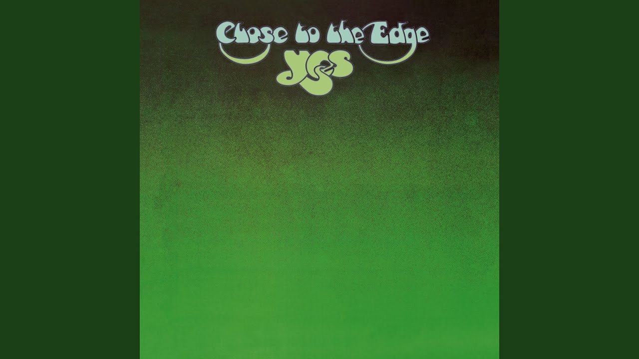
Dean’s impetus for Close To The Edge came from wanting to paint a world that was magical, miniature and like a bonsai – seemingly impossible but totally credible to the eye. “The landscape was absolutely inspired by the title. I was painting landscapes to look real, and in the most literal sense of the word, enticing. I wanted them to pull you in and make you imagine what it would be like getting on a boat to that island.”
Surprised that his floating world was chosen to reside on the interior of the gatefold, Dean came up with the simple yet distinguished green leather-bound look for the front. Warned by someone in the marketing department at Atlantic that “green doesn’t sell,” not for the first or last time in his career, Dean ignored such advice and trusted his gut.
Jon told me what Tales From Topographic Oceans would be about. I was stoned… Both of us sat staring
The now-famous logo adorning the front began life on a train ride from London to Brighton. “I started with a notion that you can put these three letters together in an interesting way, and by the time I got to Brighton I’d pretty much done it.” The design and its durability validate Dean’s bugbear that distinctive design need not be bland or boring. Inspired by his visits to the Scottish Highlands and the Lake District, the inner painting of Close To The Edge not only encapsulates the environments implicit in the music and lyrics – it offers a fictional world that’s big enough to allow listeners to project their own stories and interpretations.
“People have told me they found members of the band in the rocks on Tales From Topographic Oceans, or that they can find most of them but not Alan or Chris or whoever,” he says. “I do remember somebody asking me about some symbolism in my work and me saying it isn’t there, and basically they were imagining it. This person’s reaction was, ‘How the fuck would you know? You’re just the artist!’ In a way I know what he meant – it’s almost like automatic writing: you’re the tool of another power.”
Patterns in the land, those made by man and the forces of nature, such as dragon or ley lines, have always had a place in Dean’s interests and were part of his thinking for Yes’ most controversial album to date. “In 1973, on a flight to Japan, Jon came and sat next to me to talk about what Tales From Topographic Oceans would be about. All the way from London to Anchorage, I was stoned – I couldn’t talk and Jon was the same; both of us sat staring.
“But after Anchorage I couldn’t stop talking. We were flying over Northern Siberia and it was just magical out of the window, and I couldn’t stop enthusing about a book I’d done the cover painting for, which was John Michell’s The View Over Atlantis. It was about patterns in the landscape, hence the title. Topography is about maps: a topographic view of the landscape. That was my take on it.”
When it comes to choosing a favourite Dean cover, one he might want to put on the wall of his living room, Howe laughs. “I’ve already got the original painting for my Beginnings album on the wall,” he reveals. “But of those he did for us between 1971 and 1974, I’d have to go for Tales From Topographic Oceans. I think in a way it’s the most classically intricate and varied of them all. It’s so grandiose and with the earth and oceans on it, for me it has that sense of balance. I would say it’s one of the most incredible sleeves of that era.”
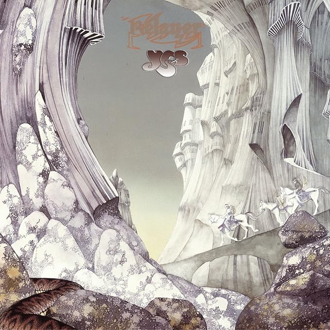
I’d never heard Relayer but I saw the title The Gates Of Delirium. I thought that should’ve been the name of the album
Working on 1974’s Relayer cover was hard, Dean admits. “It was a lot of very precise drawing. It’s so minimalist in colour, with just the faintest water-colour tints – but it’s not minimalist in ideas. The potential for narrative in that painting is enormous. I remember Jon looking at the painting and saying he wanted to call the album Relayer, pointing at the riders, and, you know, that image of the messenger. I’d never heard it at that point but I saw the title The Gates Of Delirium. I thought that should’ve been the name of the album! I’ve just done a limited-edition print of the cover after being pressed to do one for 40 years. I’ve called it The Gates Of Delirium with Relayer in brackets.”
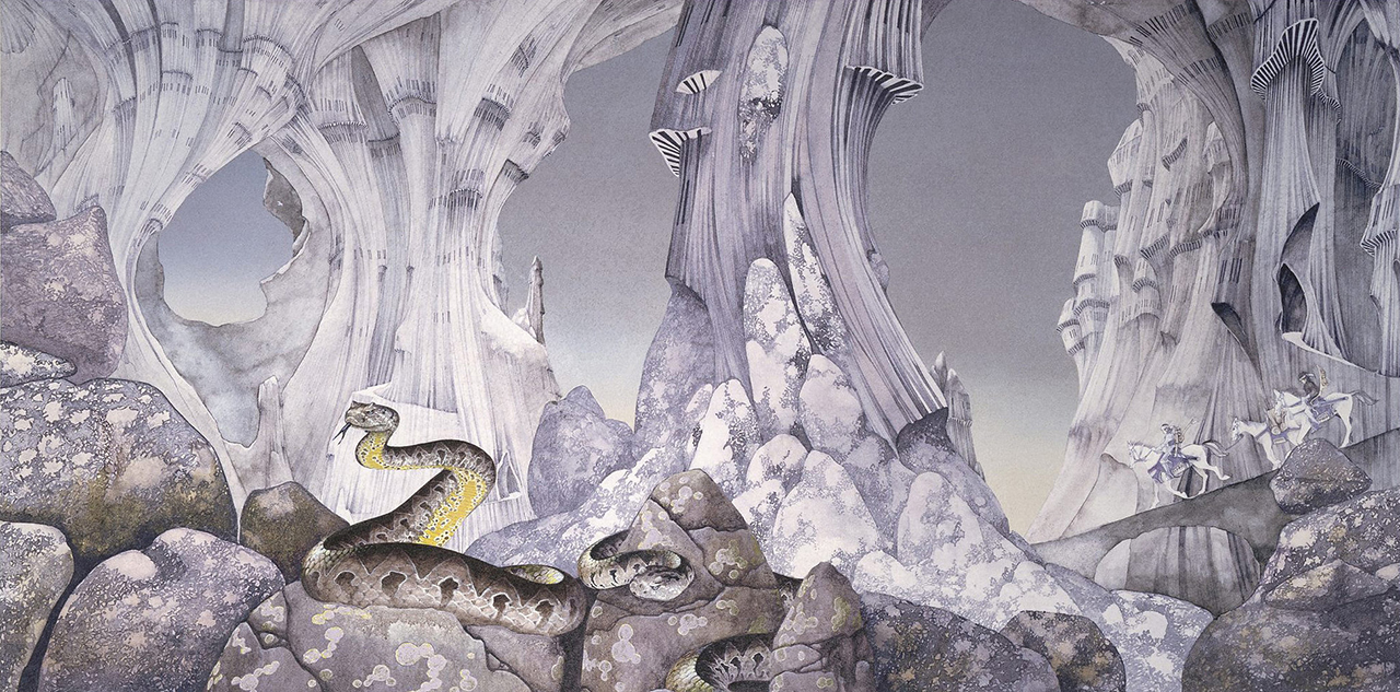
Asking him to chose a favourite out of these particular covers is a bit like asking a parent to name a preferred child. “I would have to say that the one that’s closest to my heart is what I’m going to call The Gates Of Delirium. But, week to week it changes. I can go for weeks, a month, thinking, ‘Wow, that was a bloody amazing piece – I’m so proud I did that.’ But it could be something totally different a week later, or a day or even an hour later!”
He’s preparing for an exhibition at the Los Angeles Art Show. “What I’ve spent most time doing this year is talking on the phone and presentations. What I expect to spend doing for the rest of the year is working on architectural projects; and close on the heels of that, a story with interactive elements in it. It’s a virtual project, but the architecture is meant to be completely for-real. It will be all curvilinear with spires and all the things you’d associate with my work.”
One gets a tangible sense of the creative energy that’s always driven him. That young boy who climbed Lion Rock alone, gazed at nine dragons, filled his head with fantastical landscapes and artfully charted the magical topography of those lands and oceans he imagined, all these years later, is still brimming with the visions he desperately wants to carry on exploring.
Sid's feature articles and reviews have appeared in numerous publications including Prog, Classic Rock, Record Collector, Q, Mojo and Uncut. A full-time freelance writer with hundreds of sleevenotes and essays for both indie and major record labels to his credit, his book, In The Court Of King Crimson, an acclaimed biography of King Crimson, was substantially revised and expanded in 2019 to coincide with the band’s 50th Anniversary. Alongside appearances on radio and TV, he has lectured on jazz and progressive music in the UK and Europe.
A resident of Whitley Bay in north-east England, he spends far too much time posting photographs of LPs he's listening to on Twitter and Facebook.
You must confirm your public display name before commenting
Please logout and then login again, you will then be prompted to enter your display name.
