"My symbol was about invoking and being invocative": Everything we know about the origins of Led Zeppelin's mysterious four symbols
In 1971 Led Zeppelin gave their fourth album an unpronounceable title made up of four distinct symbols, and Jimmy Page still isn't talking

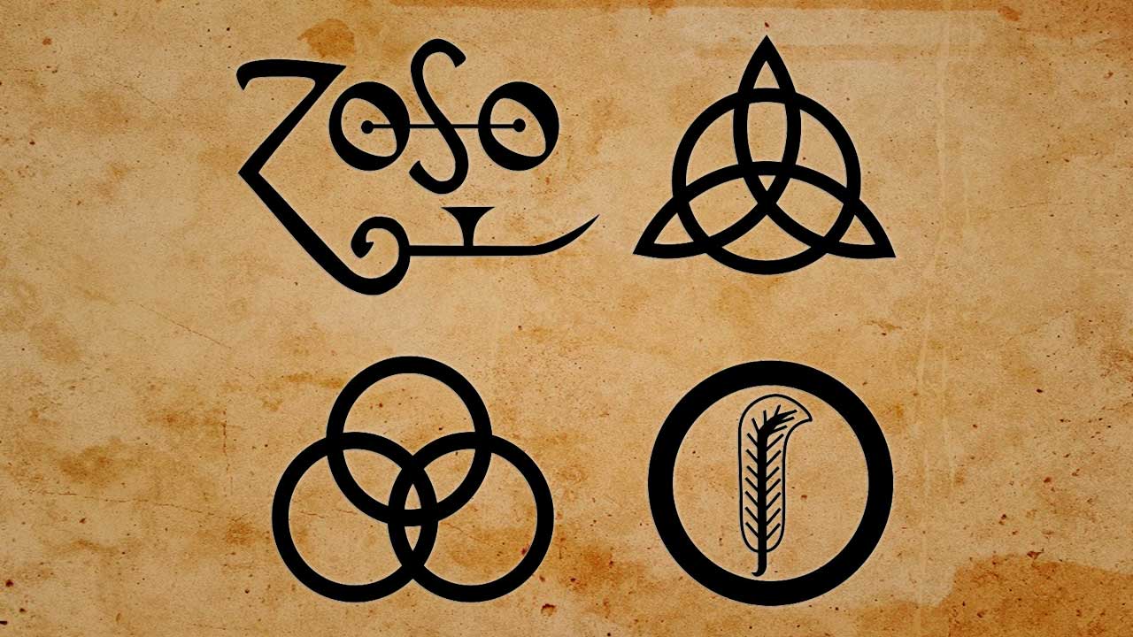
Ever on the lookout for new ideas to present Led Zeppelin in a different light, the art-schooled Jimmy Page came up with the idea of an unpronounceable title made up of four distinct symbols, or runes, for their fourth album.
“After all the crap that we’d had with the critics, I put it to everybody else that it’d be a good idea to put out something totally anonymous,” Page remembers. “At first I wanted just one symbol on it, but then it was decided that since it was our fourth album and there were four of us, we could each choose our own symbol. I designed mine, and everyone else had their own reasons for using the symbols that they used.”
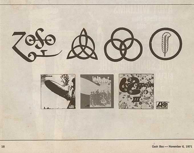
The use of four symbols as the title for IV only added to their overall mystique, and the saga of what they represent (if anything) still rages today on Zep internet forums and message boards. The four symbols were first introduced to the rock media via a series of teaser adverts placed in the music papers in the weeks leading up to the album’s release – some blank apart from the symbols, some depicting the symbols alongside the sleeves of the previous Led Zep albums.

The symbols for John Paul Jones and John Bonham were selected from Rudolph Koch’s The Book Of Signs. Jones’s is a single intersecting circle, said to symbolise a person who possesses both confidence and competence (as it’s difficult to draw accurately). John Bonham’s three interlocking rings is said to represent the triad of mother, father and child. It was also – somewhat appropriately, given the late drummer’s penchant for alcoholic beverages – the logo for Ballantine beer.
Robert plant’s symbol was apparently his own design, though it can also be traced to a book titled The Sacred Symbols of Mu by Colonel James churchward. The feather in the circle represents the feather of Ma’at, the Egyptian goddess of justice and fairness, and is the emblem of a writer. “The feather is a symbol on which all sorts of philosophies have been based,” noted Plant. “For instance, it represents Red Indian tribes.”
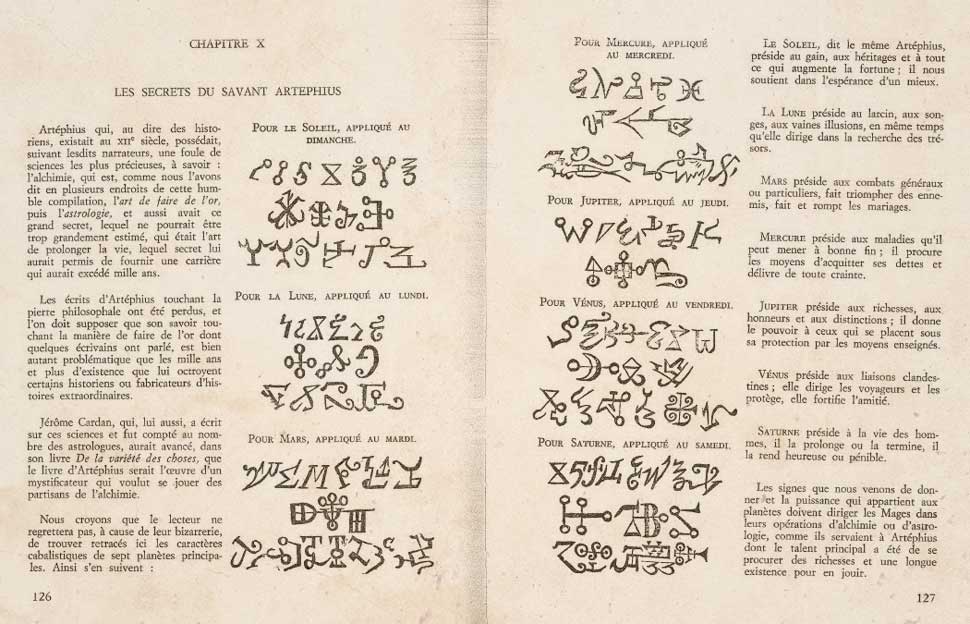
Jimmy’s symbol is often referred to as ‘Zoso’ and there have been various theories put forward surrounding its origin. Some point to it being used as early as 1557 in representing Saturn. it has also been noted that it is made up of astrological symbols for Saturn, Jupiter and perhaps Mars or Mercury. The symbol also appeared in almost identical form in a rare 19th-century dictionary of symbols titled Le Triple Vocabulaire Infernal Manuel du Demonomane, by Frinellan (a pseudonym for Simon Blocquel), published by Lille, Blocquel-Castiaux in 1844.

“My symbol was about invoking and being invocative,” Page told Classic Rock’s Mick Wall in 2001, adding, “That’s all I’m going to say about it.”
Sign up below to get the latest from Classic Rock, plus exclusive special offers, direct to your inbox!
Whatever their meaning, these symbols have become synonymous with each member of Led Zeppelin, and over the years have been adapted by Plant, Jones and Page in presenting their respective solo projects. Most recently, Plant adapted the feather design for the back cover of 2010’s Band Of Joy album, while Page used his enduring ‘Zoso’ image as the embossed cover on his deluxe pictorial autobiography Jimmy Page By Jimmy Page.
Dave Lewis is a freelance journalist and the editor and publisher of the Led Zeppelin magazine and website Tight But Loose, and author of several books on the band. Through the magazine and books, the Tight But Loose website and his Facebook page, Dave's objective remains to continue to inform, entertain and connect like minded Led Zeppelin fans new and old throughout the world – bringing them closer to the greatest rock music ever made.


