“It’s all done out of straight lines and that is not the mark of a good lettering designer”: the man who created AC/DC’s iconic logo on how it came about
Gerard Huerta was inspired by a Blue Öyster Cult idea he’d discarded

Select the newsletters you’d like to receive. Then, add your email to sign up.
You are now subscribed
Your newsletter sign-up was successful
Want to add more newsletters?
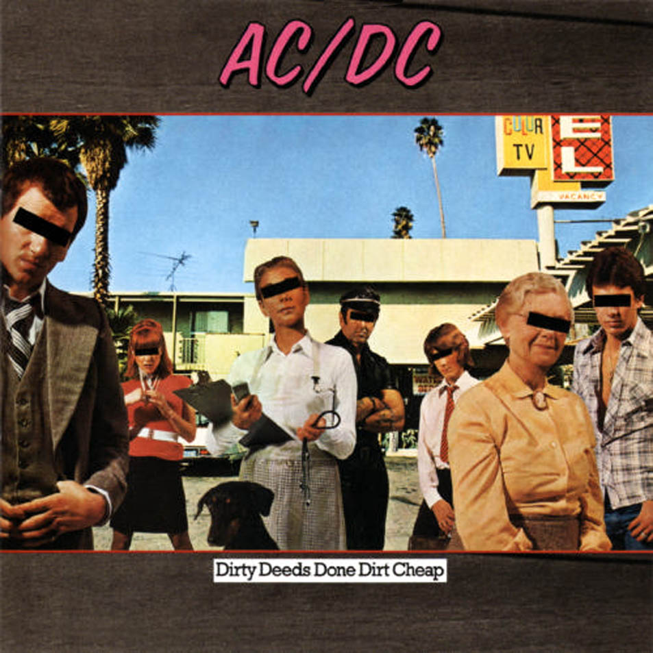
In the very competitive field of excellent rock logos, AC/DC’s is right up there. A good way to judge just how perfectly it suits the Aussie legends – jagged, barbed, imposing, timeless, mega, mega cool – is to have a look at their albums in the period before they had it. It just looks plain odd not being there, almost like it’s another band who just happen to feature a grown man in a school uniform playing a Gibson SG. You can even tell the band’s own dissatisfaction with their typography as their logo shapeshifts from record to record. On debut High Voltage, they’ve got a lean, italicised version that looks like it should belong to a new wave band or a small airline. On TNT, they went for a stencilled vibe that looked rough and ready but hardly stood out. Then there was Dirty Deeds Done Dirt Cheap’s monstrous effort, flappy wording in 80s neon, like something you’d see on a van in the background on Miami Vice.

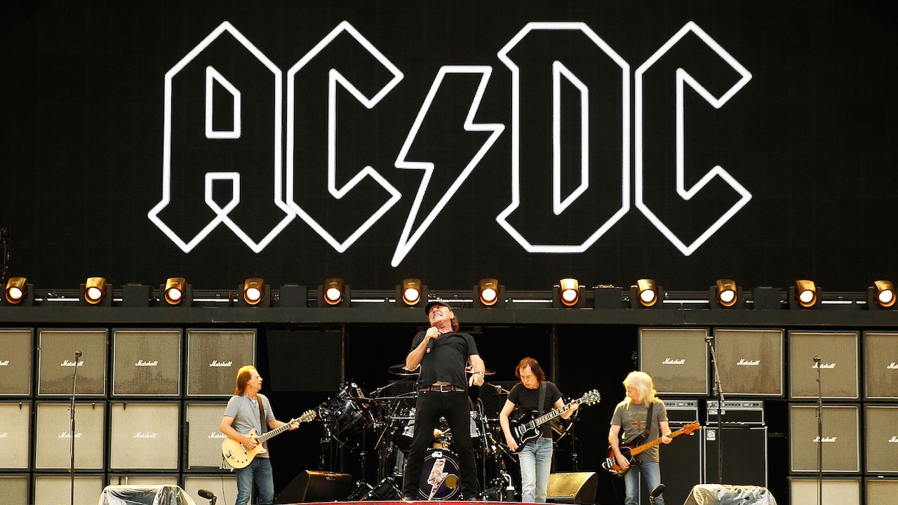
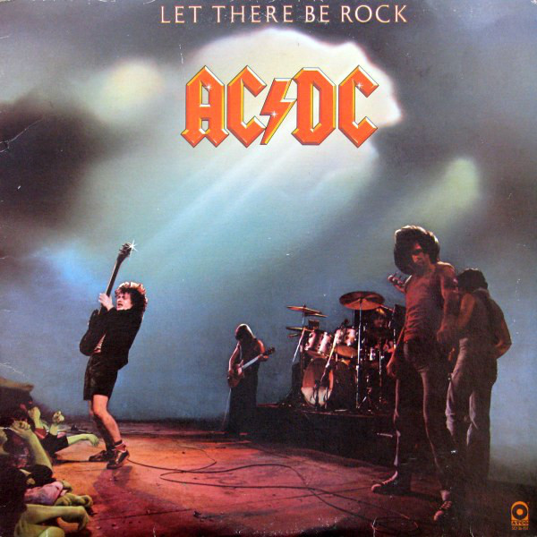
It was with Let There Be Rock that their now-classic typeface entered the fray, and designer Gerard Huerta recently told BBC 6 Music how it came about. “The idea actually came from something I had done for Blue Öyster Cult in 1975,” he said. “The album was called On Your Feet Or On Your Knees and it was a picture of a church so I thought it was might be interesting to use Gutenberg Bible Lettering for this but because there was a big Cadillac limousine in front of the church, I turned it into a car mark. So recalling that, when AC/DC came along with Let There Be Rock, which of course is a take off on a Bible saying, I went back to this Gutenberg style of lettering and then fit the letters together so that they would create a nice lock up.”
And with that, history was made. Although Huerta also explained that out of all the jobs he’s done, the AC/DC logo is the one he makes fun of because it flies in the face of good-design convention. “It’s all done out of straight lines and that is not the mark of a good lettering designer,” he said. “It’s interesting to see the generational thing because I see little kids wearing AC/DC T-shirts, which blows my mind because it’s 47-years-old.” Perhaps its simplicity is the key though, and the reason why Huerta’s straight line classic has stood the test of time.

Sign up below to get the latest from Classic Rock, plus exclusive special offers, direct to your inbox!
Niall Doherty is a writer and editor whose work can be found in Classic Rock, The Guardian, Music Week, FourFourTwo, Champions Journal, on Apple Music and more. Formerly the Deputy Editor of Q magazine, he co-runs the music Substack letter The New Cue with fellow former Q colleague Ted Kessler. He is also Reviews Editor at Record Collector. Over the years, he's interviewed some of the world's biggest stars, including Elton John, Coldplay, Radiohead, Liam and Noel Gallagher, Florence + The Machine, Arctic Monkeys, Muse, Pearl Jam, Depeche Mode, Robert Plant and more.

