Storm passes: Storm Thorgerson 1944-2013
A tribute to Storm Thorgerson, the man who reshaped the world of album art

Select the newsletters you’d like to receive. Then, add your email to sign up.
You are now subscribed
Your newsletter sign-up was successful
Want to add more newsletters?
When the obituaries are written and his Wikipedia page is updated, the fact that Storm Thorgerson was a contributor to Classic Rock, writing a monthly column on album art for 12 issues in 2009, will not be listed high among his achievements. I can live with that. Those achievements – “the best album designer in the world” (according to no less than Hitchhiker’s Guide author Douglas Adams), for one – were considerably bigger than our humble magazine.
Storm was the creator of some of rock’s most memorable and truly iconic album covers (Atom Heart Mother, Dark Side, Wish You Were Here, Houses Of The Holy, Presence, Band On The Run, The Lamb Lies Down On Broadway, Argus) and a man who worked with the biggest bands of the 70s (Pink Floyd, Genesis, Yes, T. Rex, Black Sabbath, Led Zeppelin, AC/DC, ELP, ELO, UFO, Status Quo, Bad Company). But, unlike many of his contemporaries who painted themselves into a corner or fell out of fashion, Storm kept on working right up until his death, defying the digital revolution and “the death of the album sleeve” just as he defied bad health.
Not that Storm’s style changed considerably over the decades. His 21st-century work was often instantly recognisable. (Do a Google image search for ‘Megadeth album sleeves’. Storm Studios designed only one, but I guarantee that among the skeletons, zombies and apocalyptic scenes of Megadeth’s other sleeves you will easily be able to identify which one.) If he were here now, Storm would probably call me, as he did once before, a “weasel face” or a “lopsided dickhead” for pointing this out.
Article continues below 
In the restaurant below Storm Studios on Haverstock Hill that served as an extension of his office (its staff as tolerant and patient as his own), I once happened to comment that he had a style – that you could identify his work at a glance.
Taking this as a dig – a suggestion that he was a one-trick pony – he demanded I explain what I meant. The restaurant walls were covered in his artwork, and I looked from one picture to another before coming up with what I think you’ll agree is an insight worthy of a fine-art critic.
“Blue,” I said. “They’ve all got blue skies, blue seas. It’s something to do with blue.”
(Hey, I was close: “Landscapes have always been very popular with me as a backdrop to express the breadth of music,” he told me. “I think that most music is large, it’s a big experience. In fact you could love [the same] music for years. And therefore a back alley in Islington doesn’t really carry the scope that I believe music inherently has. So, obviously, we look for big backgrounds, big skies – any excuse to go travelling…”)
Sign up below to get the latest from Classic Rock, plus exclusive special offers, direct to your inbox!
The Guardian’s John Harris suggested in the days following his death that Storm’s later work tended towards self-parody, citing relatively weak links like his work for the Cranberries’ Bury The Hatchet and Muse’s Black Holes And Revelations. In fact, I think StormStudios – who continue on, steered by Peter Curzon, Rupert Truman and Dan Abbott – produced some of their greatest work in the noughties.
You might have missed it. Apart from a few big acts (Muse, Biffy Clyro, Pendulum, the Mars Volta), the artists he worked for are not well-known names even among the most fervent music fans: O.A.R., Goose, Powderfinger, YOURCODENAMEIS:MILO, Umphrey’s McGee, Shpongle, Thornley, Disco Biscuits, Yumi Matsutoya. But that was always the way. We think of Storm as ‘designer to the gods of rock’. But even in the heyday of Hipgnosis, for every Pink Floyd there was a Public Foot, for every Led Zeppelin an Orange Bicycle.


These days Storm’s sleeves for Quatermass, Hydra, Ashra. The Greatest Show On Earth, Strife or Quiver are better known than the music itself. Equally, in the last 10-20 years of his life he produced scores of remarkable images that, if they never attained iconic status, still conferred a depth and beauty on the albums they adorned that wasn’t always there in the music.
He himself would never say that. Storm was notoriously truculent, but he was not a bitch. He was rarely indiscreet about an artist, neither gossiping about them personally nor divulging inner-circle secrets. If he had something to say, he’d say it for the record. An example? In August 2012 we met up for a feature I was planning to write on him. It was to be about him, rather than his work. About a man who spent his life creating beautiful things for often ungrateful rock stars, taking work that sometimes seemed to have been thrown up in rehearsal room jams and dressing it up in images imbued with depth and shimmering with beauty.
He’d agreed to the feature but he had his own agenda. He came with notes. The bone of contention: Storm Studios had worked on an image for Muse’s The 2nd Law (an image he called ‘Scrutiny’, pictured below) and had it rejected in favour of a “found image” of a ‘brain map’ favoured by the band’s Matt Bellamy.
“I think that this is born of ego,” Storm said. “An ego that thinks it knows better; which would of course not be true if he was hiring a euphonium player. He wouldn’t hire one of them unless he liked them, and he wouldn’t tell a euphonium player how to play. You hire a dog to bark, not bark yourself. So the example with Scrutiny, apart from my disappointment and sour grapes, all of which of course is included, is that I think: wait a minute, why use something you’ve found? You could use Picasso, Rembrandt, you could even use Van Gogh – the most expensive painting in the world – but what does it tell you?”
I pointed out that those images are ‘loaded signifiers’, full of meaning (reminding the viewer of history, art movements, lost cultures, the sanctified world of high art etc), while Bellamy’s anonymous brain map was abstract, inoffensive and came with little baggage. I was missing the point: “If you borrow one thing, you can borrow anything!” he snapped. “It’s easy-peasy. Why not go and find a bit of found music? Then you needn’t fucking record it either.”


The principle was clear: artists are here to create. Borrowing someone else’s work just doesn’t cut it, dear boy. (“I once accused Damien Hirst of stealing my ideas,” he added. “He said: ‘Well, that’s cos you have lots of good ones.’ It made me laugh so I forgave him immediately. Mind you, I might ask where Danny Boyle got all his beds from [for the Olympic Games opening ceremony]. But I wouldn’t, of course. Modesty forbids me.”)
As long as I knew him – and don’t get me wrong, I didn’t know him that well (half-a-dozen lunches, dozens of emails and phone calls) – Storm suffered from bad health. I met him in 2007. Omnibus, the publishers of his then-new book Taken By Storm, said he had something to say about the death of the album sleeve in the age of the digital download.
In fact, when I turned up it seemed that he’d already tired of the whole debate and the assumption that he was going the way of the dinosaurs. “We say: ‘Long live the album cover,’” he harrumphed. “Can we move on? Get away from this insidious line of questioning?”
Later he emailed me, trying to sound me out on what angle I was taking. I was deliberately vague with my answer, suggesting that he might not like what I had to say. “Just remember,” he replied, “revenge may be awesome.” It became a catchphrase in the Classic Rock office for years, something muttered behind the backs of anyone who got on our shit-list: revenge may be awesome.


A gallery of classic Storm Thorgerson/Hipnogsis sleeves, including Pink Floyd, Led Zeppelin, AC/DC, Black Sabbath and more.

A gallery of classic Storm Thorgerson/Hipnogsis sleeves, including Pink Floyd, Led Zeppelin, AC/DC, Black Sabbath and more.
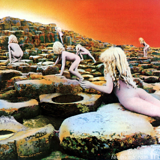
A gallery of classic Storm Thorgerson/Hipnogsis sleeves, including Pink Floyd, Led Zeppelin, AC/DC, Black Sabbath and more.

A gallery of classic Storm Thorgerson/Hipnogsis sleeves, including Pink Floyd, Led Zeppelin, AC/DC, Black Sabbath and more.

A gallery of classic Storm Thorgerson/Hipnogsis sleeves, including Pink Floyd, Led Zeppelin, AC/DC, Black Sabbath and more.

A gallery of classic Storm Thorgerson/Hipnogsis sleeves, including Pink Floyd, Led Zeppelin, AC/DC, Black Sabbath and more.

A gallery of classic Storm Thorgerson/Hipnogsis sleeves, including Pink Floyd, Led Zeppelin, AC/DC, Black Sabbath and more.

A gallery of classic Storm Thorgerson/Hipnogsis sleeves, including Pink Floyd, Led Zeppelin, AC/DC, Black Sabbath and more.
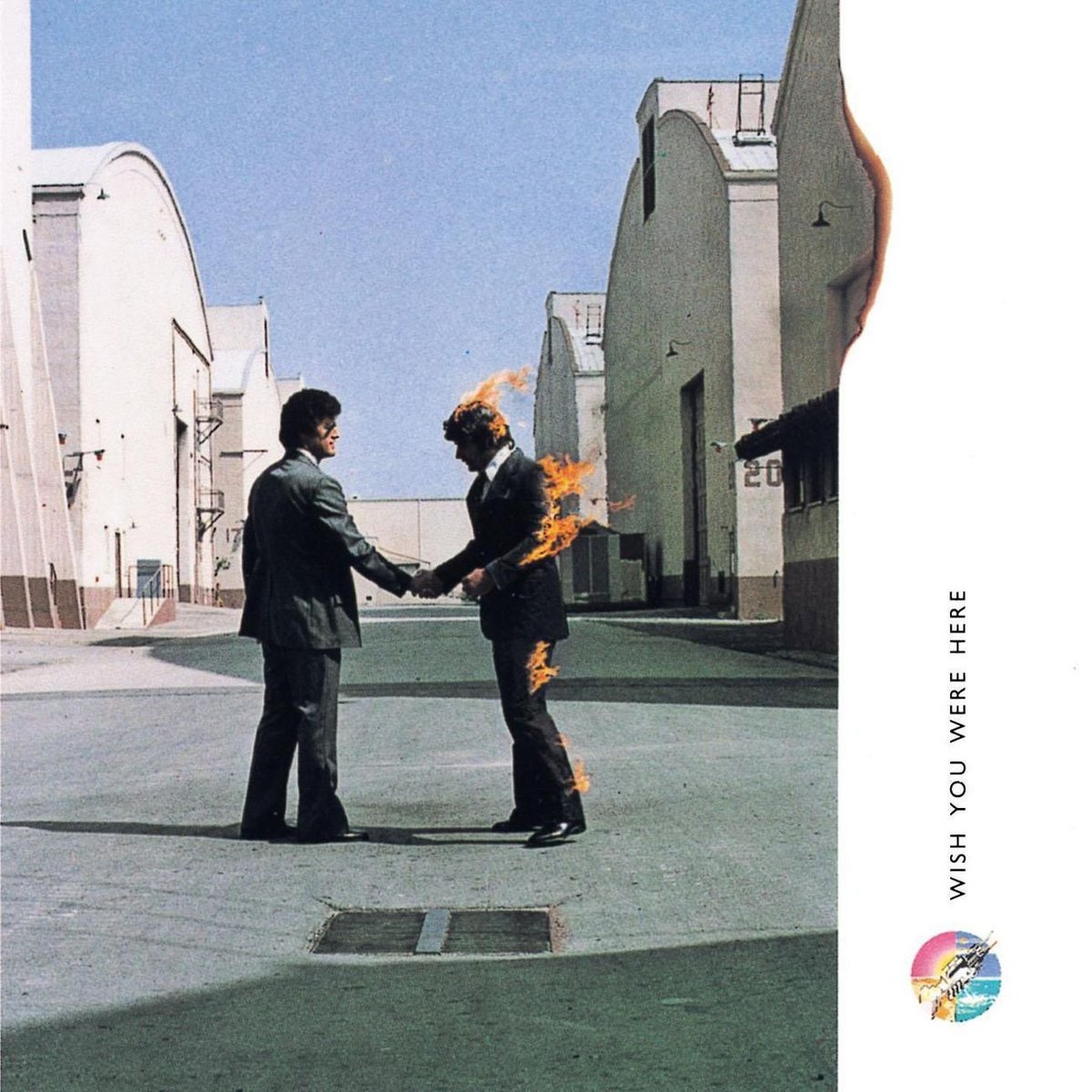
A gallery of classic Storm Thorgerson/Hipnogsis sleeves, including Pink Floyd, Led Zeppelin, AC/DC, Black Sabbath and more.

A gallery of classic Storm Thorgerson/Hipnogsis sleeves, including Pink Floyd, Led Zeppelin, AC/DC, Black Sabbath and more.
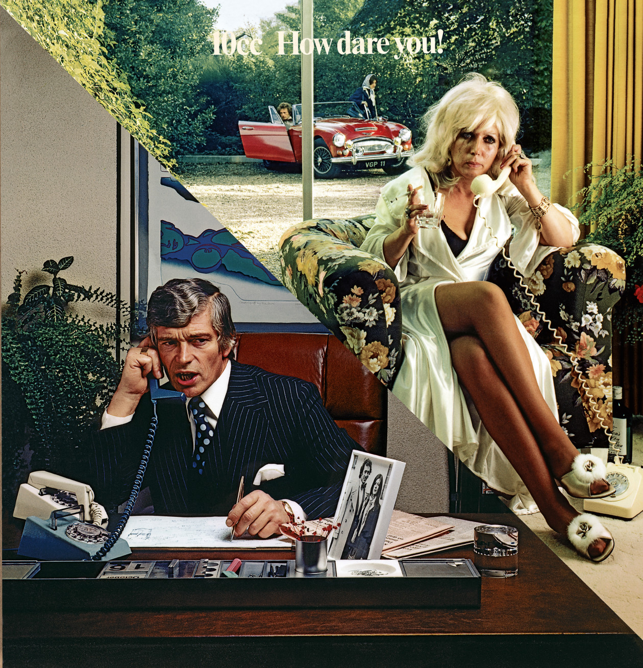
A gallery of classic Storm Thorgerson/Hipnogsis sleeves, including Pink Floyd, Led Zeppelin, AC/DC, Black Sabbath and more.
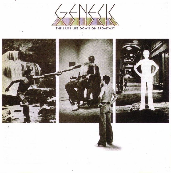
A gallery of classic Storm Thorgerson/Hipnogsis sleeves, including Pink Floyd, Led Zeppelin, AC/DC, Black Sabbath and more.
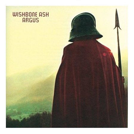
A gallery of classic Storm Thorgerson/Hipnogsis sleeves, including Pink Floyd, Led Zeppelin, AC/DC, Black Sabbath and more.
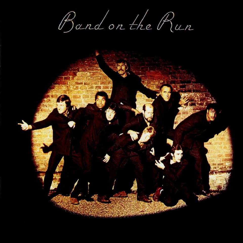
A gallery of classic Storm Thorgerson/Hipnogsis sleeves, including Pink Floyd, Led Zeppelin, AC/DC, Black Sabbath and more.

A gallery of classic Storm Thorgerson/Hipnogsis sleeves, including Pink Floyd, Led Zeppelin, AC/DC, Black Sabbath and more.
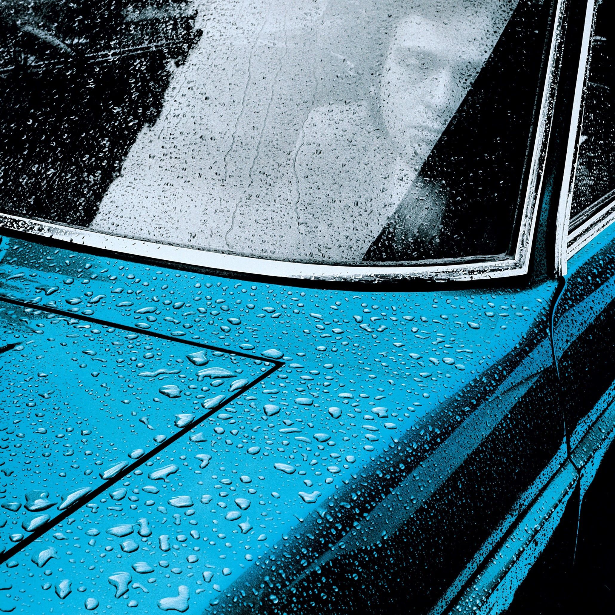
A gallery of classic Storm Thorgerson/Hipnogsis sleeves, including Pink Floyd, Led Zeppelin, AC/DC, Black Sabbath and more.
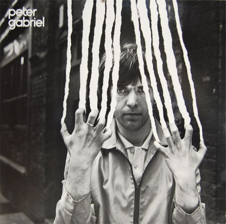
A gallery of classic Storm Thorgerson/Hipnogsis sleeves, including Pink Floyd, Led Zeppelin, AC/DC, Black Sabbath and more.
Presumably he did like what I’d written, because later he asked me to contribute a chapter for his book For The Love Of Vinyl. I was to write about The Dark Side Of The Moon sleeve. I said yes, although I had no idea what to say about the most iconic album cover of all time and spent most of the 2,000 words writing around the subject, roping in stories about my old physics teacher and Glaswegian junkies instead of actually addressing the sleeve itself.
(If that book was a website I’d update it right now with something about how today I see the Dark Side sleeve as a comment on transformation and artistic vision – about Pink Floyd’s white light hitting Storm’s prism and turning both of their worlds Technicolor.)
In November 2012, he asked me to write another chapter for his book Gathering Storm. Just like the first thing I ever wrote about him, he wanted me to write about his art in the noughties, and the role of cover art in a culture slowly phasing out physical product. There was no money in it, so I agreed to do it in return for a print of his Biffy Clyro Only Revolutions sleeve – a friend of mine was getting married and was a big Biffy fan. I had a signed print within a week.
It was the last time I saw him. I was stressed and he was late. I sat in a restaurant in Hampstead for almost an hour before he showed, pushed in on a wheelchair, looking like death and talking frankly about it too. I couldn’t hang around. I had a deadline. Glenn Hughes’s manager called in the middle of the meeting and I had to take it – we were running a big contentious story on Black Country Communion’s split, and paths needed smoothing. I had to dash. His brother was coming for him, so I left him there. He’d been talking about The End for so long I thought he’d live forever.
I spoke to him a few weeks later. I’d handed in my chapter, and he liked it. The ending had made him laugh, he said. I’d quizzed him about one of the sleeves he’d designed for a Japanese singer called Yumi Matsutoya – I’d been trying to listen to the music of the bands he’d ‘dressed’ in the noughties but couldn’t find anything on this Yumi. The next thing I know there’s a delivery for me – it’s the Yumi sleeve. It’s hanging on the wall of my living room as I type (and pictured below).
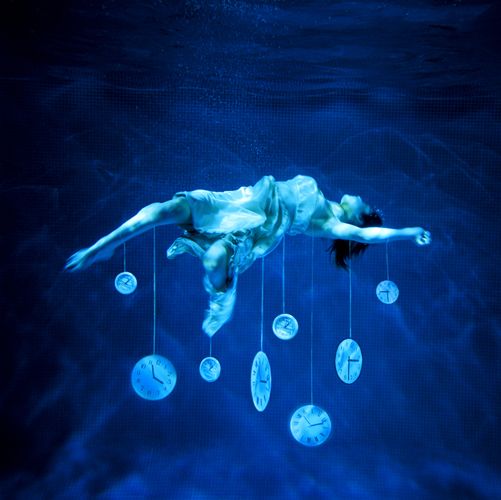
Does it mean something? I should coco. It’s beauty murdered by time, life’s heat extinguished by time’s icy grip. It’s Ophelia killed by Hamlet’s prevarication. It’s “the weight of memories”, in Storm’s own words, about how your past can drag you down. It’s me leaving him in a restaurant in his wheelchair cos I’ve got a deadline, me thinking I just spoke to him a few weeks ago and I’ll give him a call once I’ve done this, him telling me four years before that “the future is a bit cloudy health-wise”.
But most of all it’s about that blue. That deep, endless, gorgeous blue.
I mean, c’mon. I was right about that blue thing, wasn’t I?

Scott is the Content Director of Music at Future plc, responsible for the editorial strategy of online and print brands like Louder, Classic Rock, Metal Hammer, Prog, Guitarist, Guitar World, Guitar Player, Total Guitar etc. He was Editor in Chief of Classic Rock magazine for 10 years and Editor of Total Guitar for 4 years and has contributed to The Big Issue, Esquire and more. He is the author of the Sunday Times Bestseller, Stay Alive: The Life & Death of Stuart Adamson and was the writer/researcher on 2017’s Mick Ronson documentary Beside Bowie.
