Hipgnosis: the album art the bands rejected
Aubrey Powell, one of the founders of legendary design studio Hipgnosis, on the art that didn't make it past the musicians
Aubrey “Po” Powell, co-founder of the legendary design studio Hipgnosis, talks about his archive of unseen work, art that features in a beautiful new book, Hipgnosis Portraits. Here, he talks about some of the concepts that didn’t make the grade.

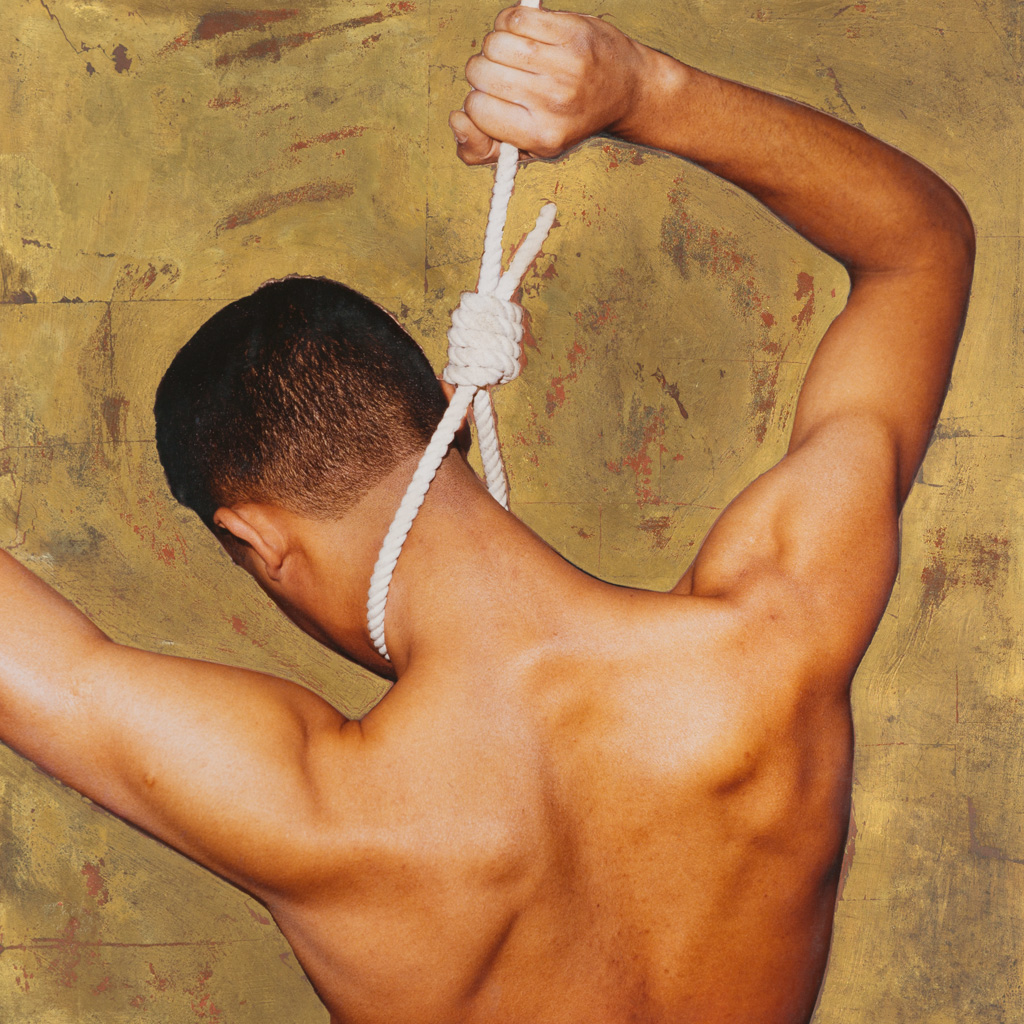
Paul McCartney, Tug Of War
Peter Christopherson, the third partner in Hipgnosis, came up with this image that was reminiscent of Gustav Klimt, with this lovely gold colour, but of a boy hanging himself. Paul wanted ideas for Tug Of War and Peter and Storm insisted we show him this idea. So Storm and I went to Paul’s house in St Johns Wood and were sitting in his kitchen and pulled out these ideas. He looked at this one, said “This is a very interesting idea, beautifully done, but it’s just not for me.” But I loved that he appreciated the art of it.
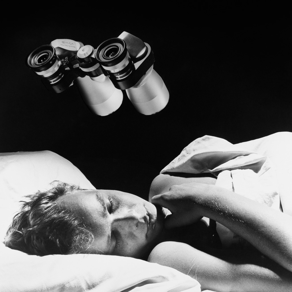
Foreigner, 4
Before it was called 4, the album was called Silent Partners. We pitched this idea of a young boy under surveillance but Foreigner’s record company and their manager didn’t want to use it, because they thought it looked “too gay”. This had happened before with Hipgnosis’ cover for Yes’s Going For The One, which featured the back of a naked man. The record company hated it, but went with it anyway. Bud Prager actually wanted us to change the boy to a fourteen-year-old girl, but we refused. Our image was more ambiguous and mysterious and we thought we’d lose the potency. Plus we hated anything homophobic. So we got blown out. The cover Foreigner did use for 4 was, I thought, as dull as ditchwater
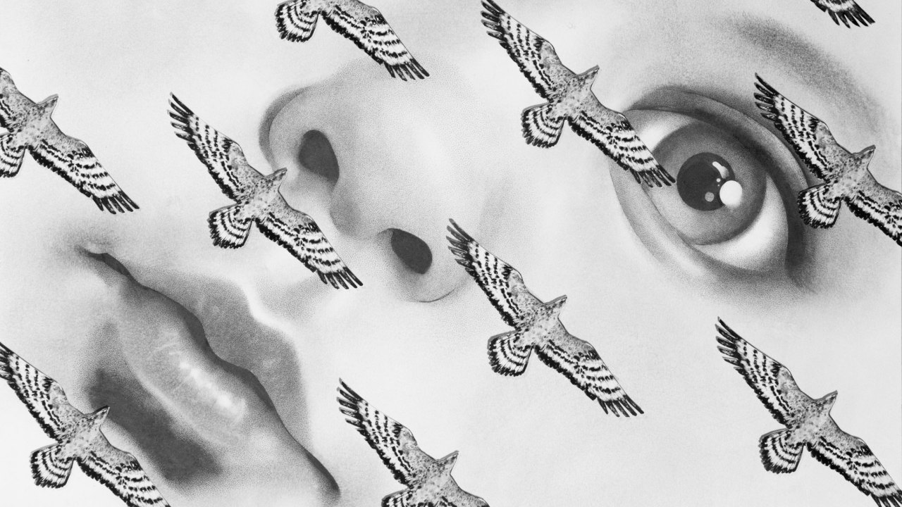
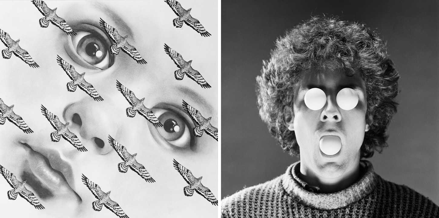
Queen, Greatest Hits
We met up with Freddie Mercury at Roger Taylor’s house in Fulham, and discussed the idea of the face with table tennis balls in both eyes and the mouth. The image on the back cover was going to have someone hammering a ball with a table tennis bat – hence greatest ‘hits’. But Freddie Mercury wasn’t having any of that. The baby’s face was just an idea that we liked. Queen didn’t. Looking back, Queen had their own imagery – very sensual and moody, as you can see in Mick Rock’s photo for Queen II. Our ideas were more surreal. I don’t think Hipgnosis were Queen’s cup of tea.
Sign up below to get the latest from Classic Rock, plus exclusive special offers, direct to your inbox!
Scorpions, Blackout
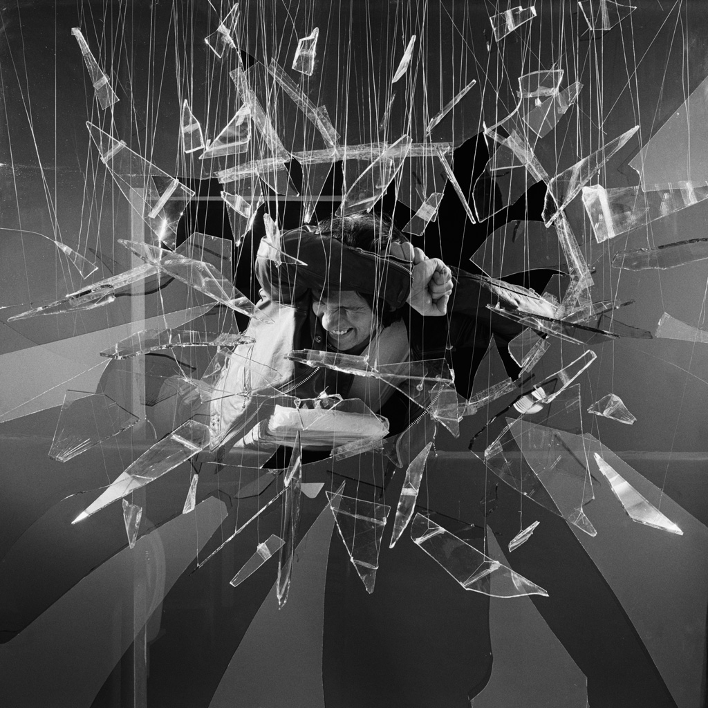
We’d designed covers for Lovedrive and Animal Magnetism, before we were asked to work on Blackout. We knew how they filmed people smashing through glass in the movies, so we decided to do the same. But we must have used up fifty panes of special frosted glass in half an hour and we still couldn’t get the right shot. So we decided to hang the individual pieces of glass in the places that we wanted them. Our assistants spent five days hanging all these glass pieces with thin nylon thread and superglue. It looks ridiculous, but I think it has the atmosphere of a living sculpture.
We showed it to the Scorpions, but they didn’t like it. Instead they told us they were using a drawing of the guitarist [with forks over his eyes] that I hated. Storm actually wrote a letter, which we didn’t have room for in the book, to their manager that read, “I know your band hate our cover… but I think what you have got there is a crock of shit.”
