The story behind every single Metallica album cover art
Electric chairs, toilet bowl stabbings and, erm, semen – the Four Horsemen have had quite the eclectic visual journey
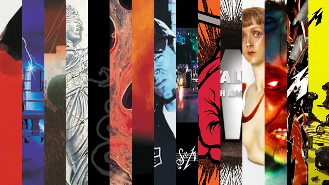
We all know about Metallica’s restless musical evolution. From high-speed thrashers to avant-garde rockers and back again, they’ve refused to stay still over their 40 years of metal-making. Just as interesting, however, has been the band’s visual development. Who could ever have imagined that the long-haired rebels who crammed ...And Justice For All with political jabs would end up covering one of their albums in cum just eight years later? To celebrate this eclectic journey, we've corralled the stories of every Metallica album cover, from Kill ’Em All all the way to the imminent 72 Seasons.

Kill ’Em All (1983)
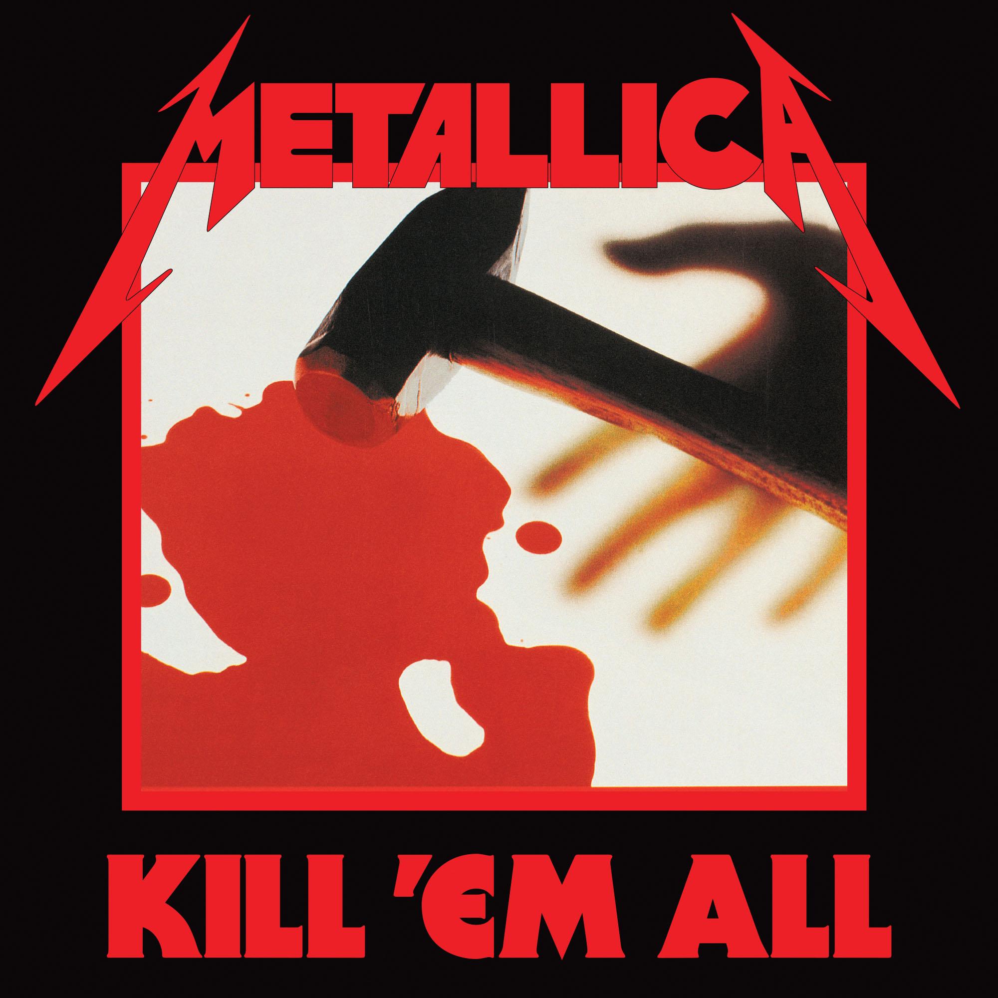
Infamously, Metallica’s debut album was supposed to be called Metal Up Your Ass. The band had long had the phrase emblazoned on their concert posters, and there was even cover artwork by Stephen Gorman, depicting a knife rising out of a toilet, ready to go. However, Megaforce Records got cold feet over the graphic imagery and title. Cliff Burton’s outraged response to the news was, “Fuck those fuckers, man! Those fucking record outlet people! Just, we should, just...kill ’em all!" And, just like that, Metallica’s debut got its name. The new artwork of a blood-soaked sledgehammer was done by Gary L. Heard.
Ride The Lightning (1984)
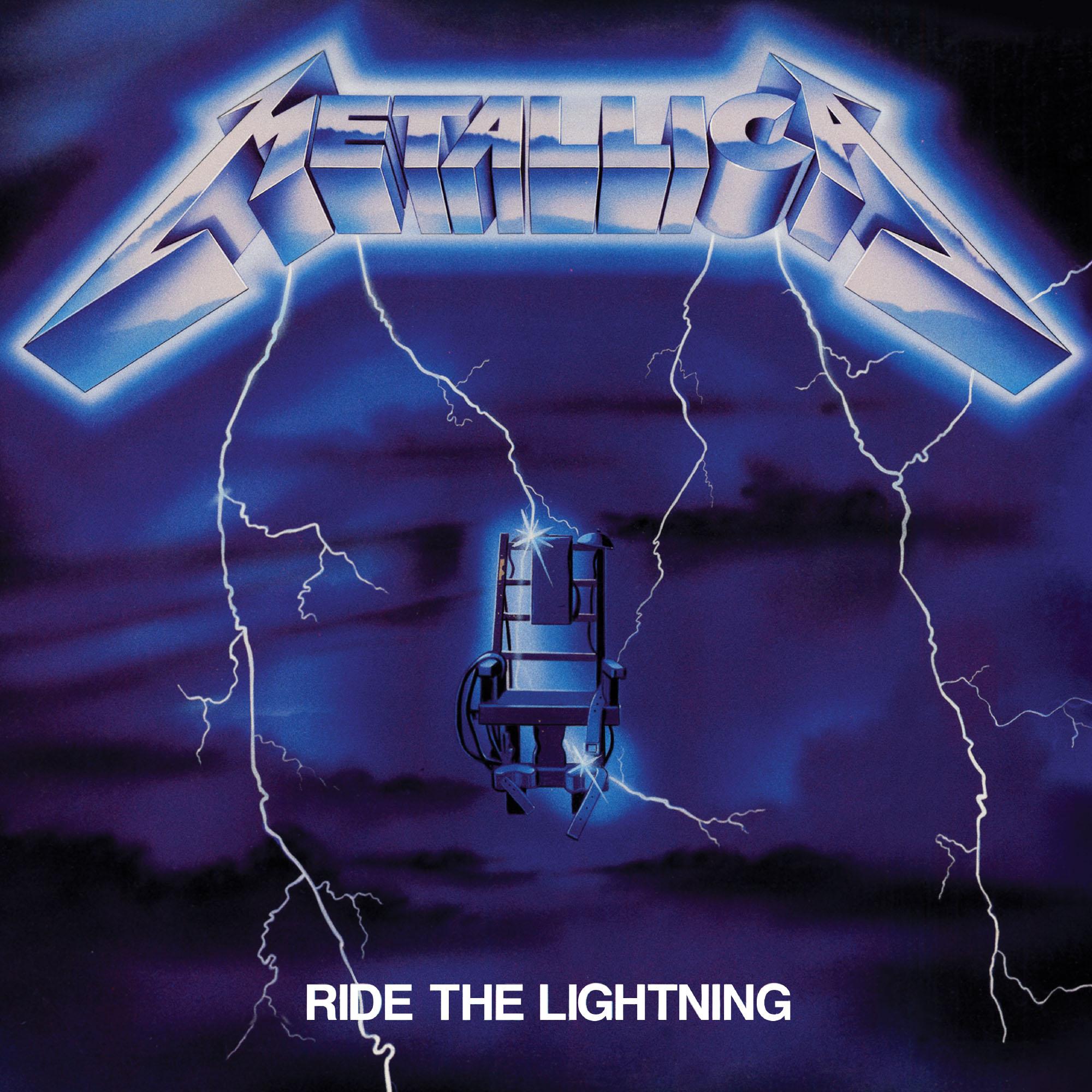
While Kill ’Em All was a phrase from Cliff Burton’s mouth, the name Ride The Lightning was Kirk Hammett’s brainchild. The guitarist was reading The Stand by Stephen King while Metallica were recording their debut and the phrase (slang for execution by electric chair) stuck with him. It stuck with James Hetfield, too, who wrote the album’s title track when Kirk mentioned it. The blue cover by AD Artists appropriately flaunts an electric chair front and centre – although, in France, a printing error meant the first pressing was green. Today, those copies are hugely sought-after collectors' items.
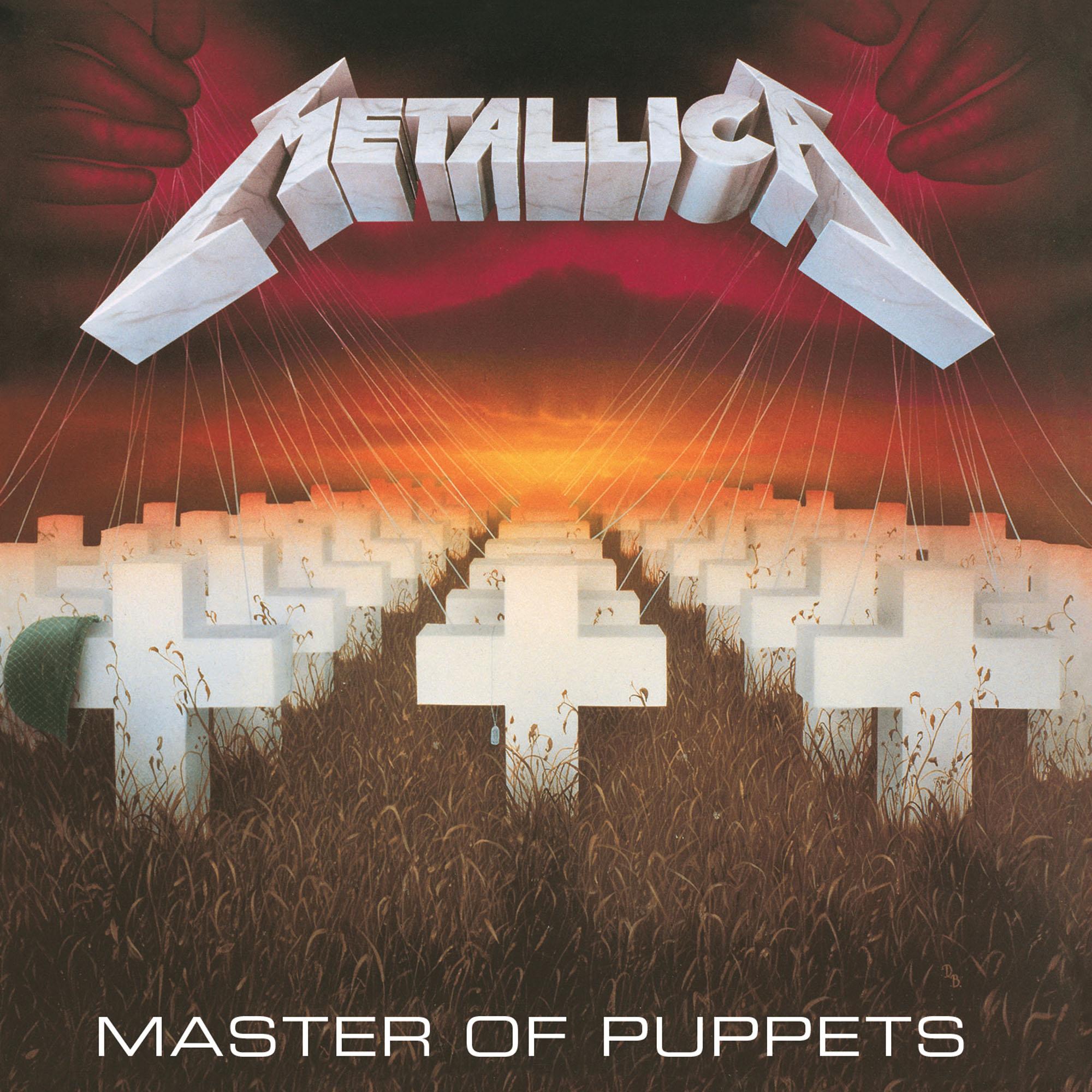
Master Of Puppets (1986)
By mid-1985, Metallica were truly on the up and up, so they were able to commission the art for their then-upcoming third album from Don Brautigam: an acrylic painter who’d worked with Chuck Berry, James Brown and Stephen King. Don did the cover in only three days, basing the painting off of a sketch by James Hetfield. The scene bears a strong resemblance to Arlington National Cemetery, while the hands in the sky visualise Master Of Puppets’ central theme of manipulation, whether that’s manipulation by military leaders in Disposable Heroes, vicious doctors in Welcome Home (Sanitarium) or drugs in the title track.
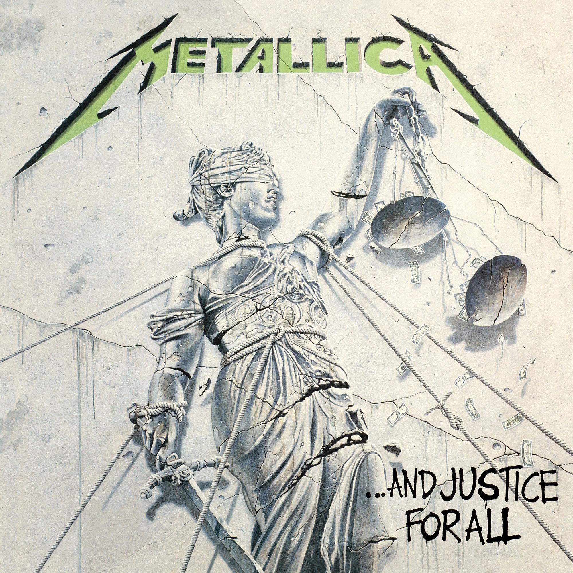
…And Justice For All (1988) (and The $5.98 EP: Garage Days Re-Revisited (1987))
Far and away Metallica’s most political statement, …And Justice For All visualises the social commentaries of its title track and One with that cover art. It depicts a shattered, restrained and bare-breasted Lady Justice with money dropping from her scales, all painted by Stephen Gorman. Stephen previously created the scrapped Metal Up Your Ass cover, and his brother Roger had recently photographed the band – and their new bass player, Jason Newsted – for the front of their $5.98 covers EP. The photorealist design, based on a statue in Munich, proved to be the perfect kind of striking, and it complimented Justice’s bold manifesto.
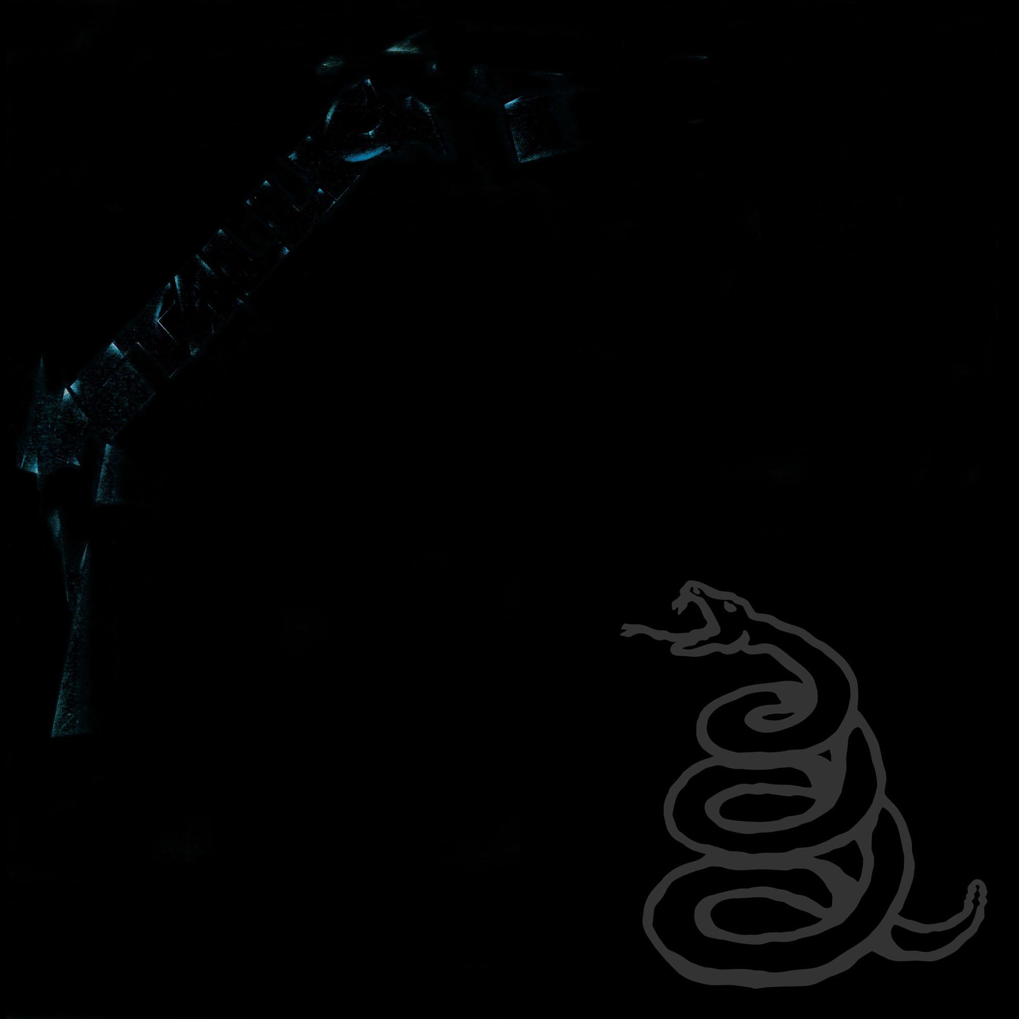
Metallica (1991)
…And Justice For All was all about extravagance: eight-to-ten-minute-long songs, countless riff changes and worldly themes. For Metallica, playing such massive movements night in and night out on tour proved exhausting. So, the Black Album stripped metal back to its basest elements, emphasising hooks and slow, hulking grooves. The artwork was similarly simple. It was all black, bar a dark grey band logo on the top left and a coiled rattlesnake on the bottom right. Said serpent was taken from the Gadsden flag and referenced the American War Of Independence-inspired lyrics of Don’t Tread On Me. Spinal Tap still weren’t impressed, though…
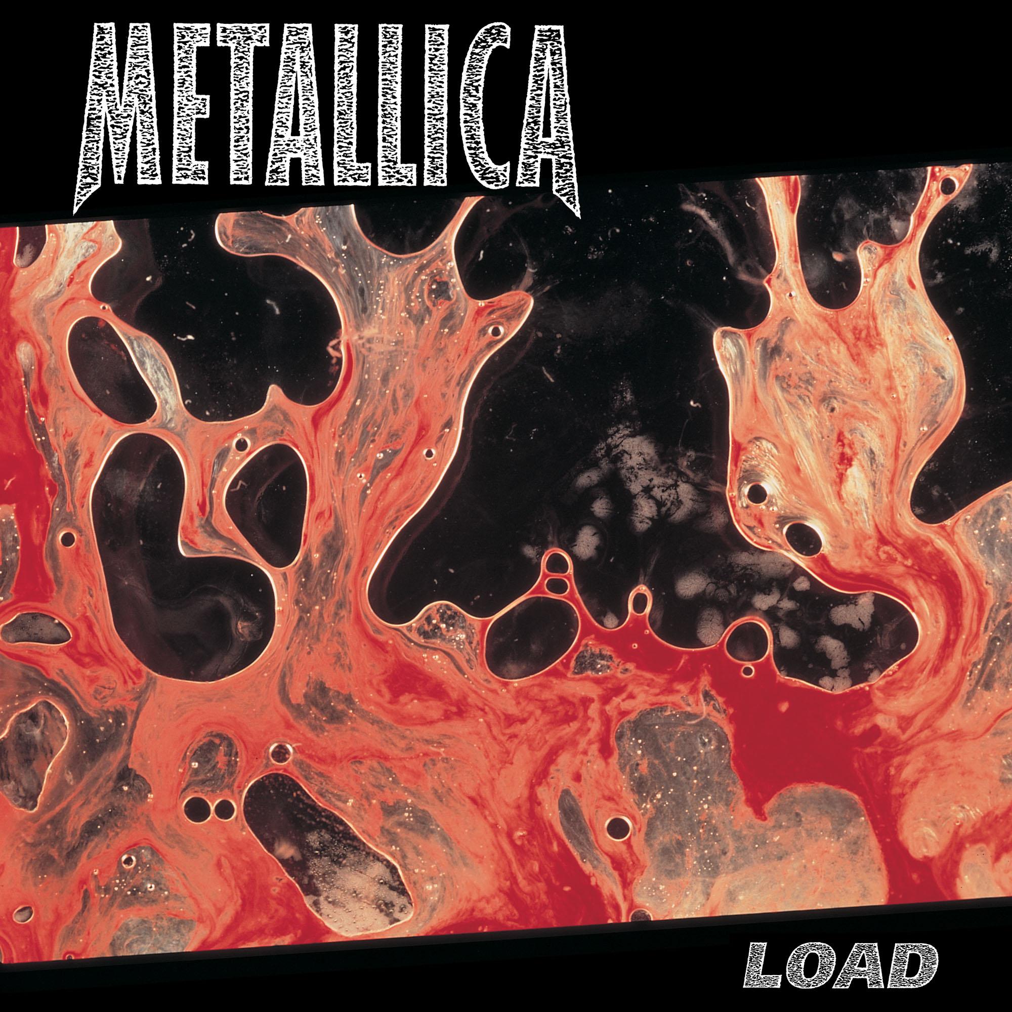
Load (1996) and Reload (1997)
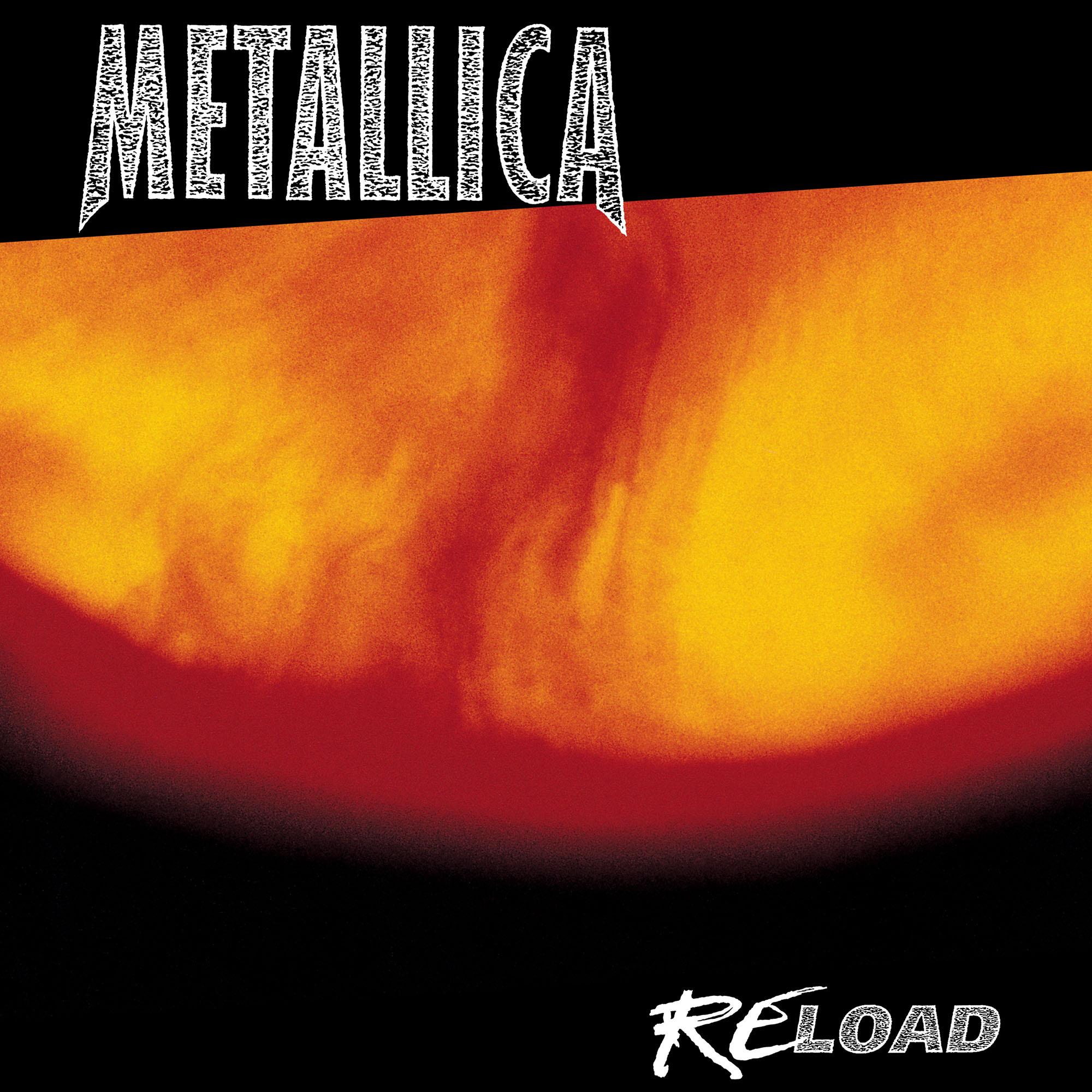
Metallica’s art rock era featured their most controversial music, their most controversial wardrobe and their most controversial artworks. Suddenly, metal’s biggest band were avant-garde blues rockers with short hair and mafia outfits – and they were putting piss and cum on their albums. The ever-inflammatory Andres Serrano designed both Load and Reload’s covers. The former is a photograph of bovine blood mixed with the artist’s semen, while the latter is bovine blood and his own urine. Apparently all of this was Kirk Hammett and Lars Ulrich’s idea. James Hetfield, on the other hand, has called Load’s artwork a “piss-take” in interviews.
Sign up below to get the latest from Metal Hammer, plus exclusive special offers, direct to your inbox!
Garage, Inc. (1998)
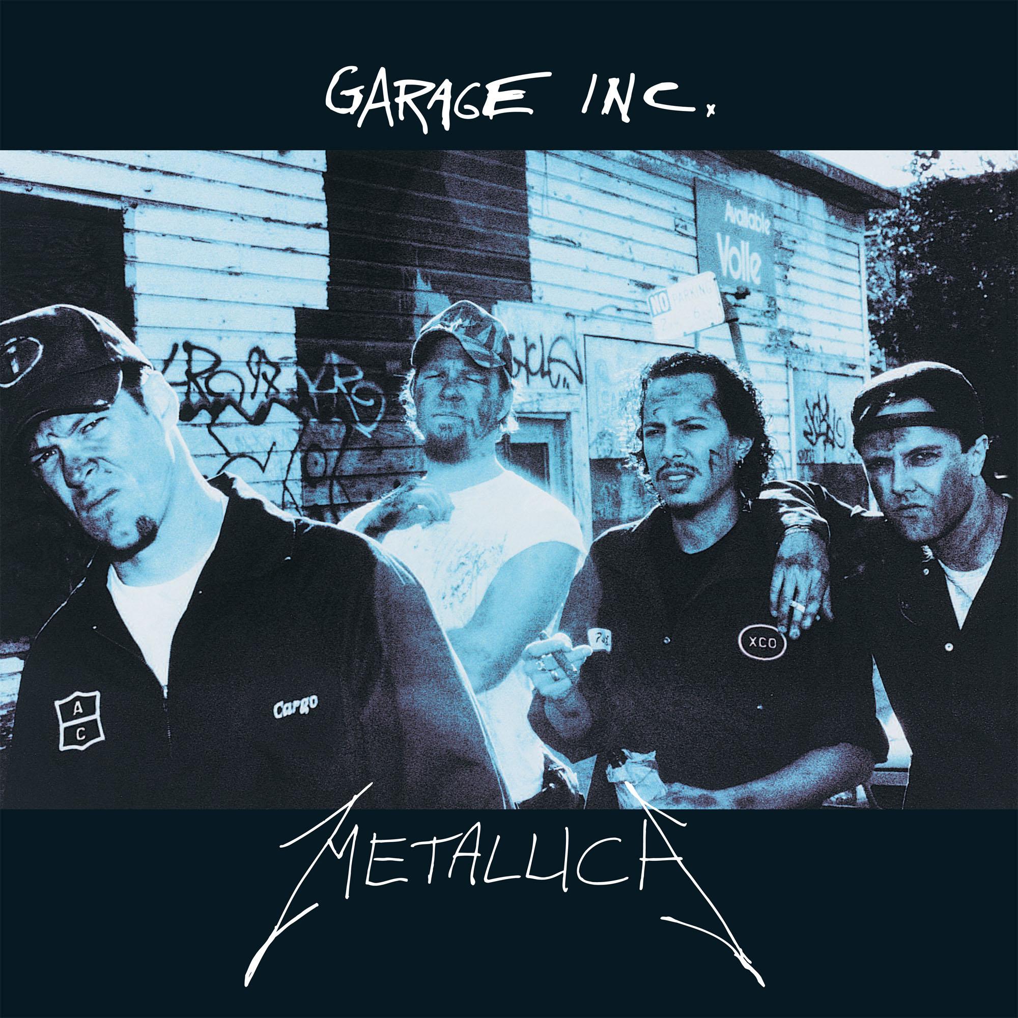
Between the art rock pageantry of Load and Reload and the symphonic grandeur of S&M, Metallica kept their palate fresh by revisiting their roots on a two-disc covers album. Garage, Inc.’s title references both Garage Days Revisited – the name Metallica gave the b-side of Creeping Death, which saw them cover Am I Evil? and Blitzkrieg – and Master Of Puppets finale Damage, Inc.. For the cover, Anton Corbijn took the title more literally and photographed the band in mechanics’ garb. Anton was no stranger to making Metallica play dress-up, since he handled the photoshoots during the Load/Reload era as well.
S&M (1999)
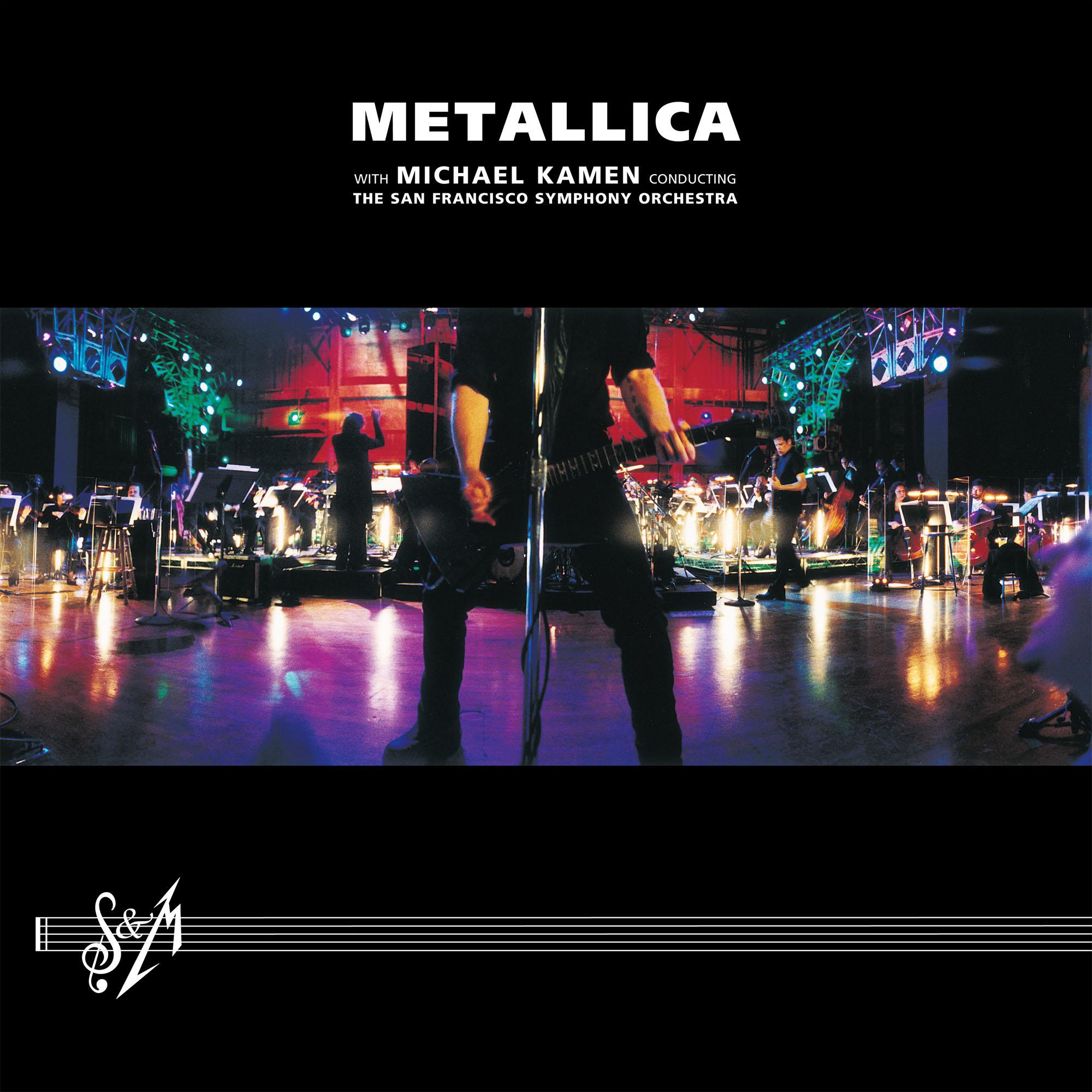
After Load reinvented Metallica but rocketed to number one in 18 countries, the Four Horsemen kept pushing the envelope on S&M. Never before had a full-on heavy metal act and an orchestra played the band’s songs with classical accompaniment for an entire evening. The novelty of the idea sold itself, so the cover kept things simple. Anton Corbijn’s photo shows James Hetfield playing, with a panorama of the San Francisco Symphony Orchestra behind him. Filling the negative space below is a stylised version of the title S&M, which both stands for “symphony and Metallica” and is a sex pun. Har-dee-har.
St Anger (2003)
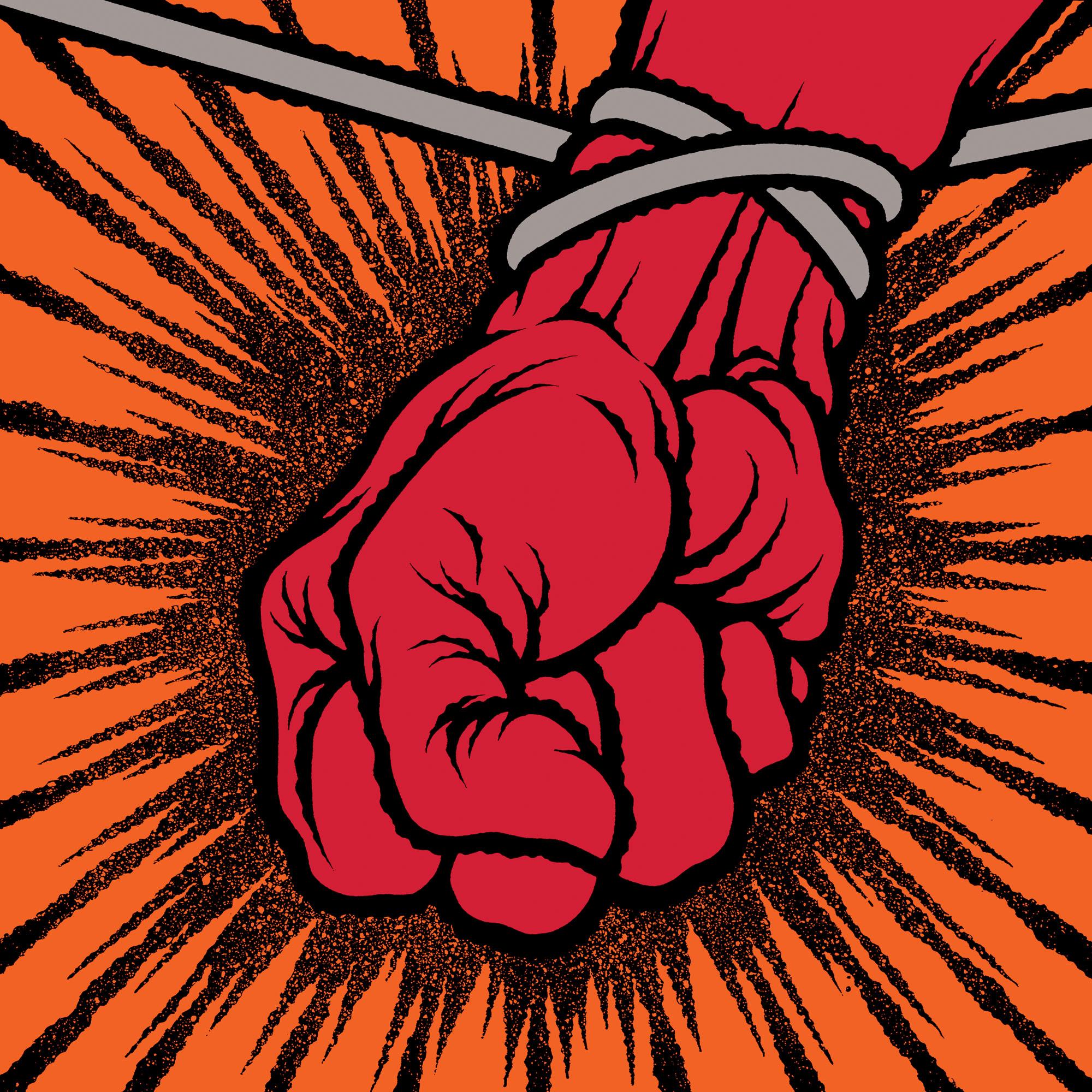
Regarded as the nadir of Metallica’s career by people who haven’t listened to Lulu, St Anger saw the band retreat to safety following the departure of 15-year-tenured bassist Jason Newsted. It was raw, loud and simple – and horribly produced and overly long, if you believe the detractors. Nonetheless, those core values were also carried by the Brian Schroeder-designed artwork. It’s a simple but impactful piece depicting a tethered fist, using eye-catchingly solid reds and oranges. Originally, four different colour variants were planned, similar to Andy Warhol’s style of pop art. However, for one reason or another, this idea never came to fruition.
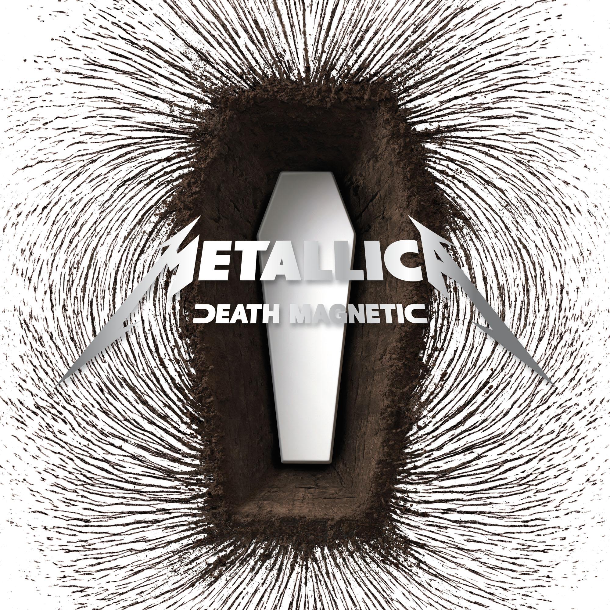
Death Magnetic (2008)
After fans greeted St Anger with the kind of goodwill usually reserved for overthrown dictators, Metallica decided to be a thrash band again. Death Magnetic reintegrated what so many fans first loved the band for: titanic anthems, progressive ballads and lightspeed rhythm guitar, united under the banner of a badass title. According to James Hetfield, Death Magnetic “started out as a tribute to people that have fallen in our business, like Layne Staley. Death [is] like a magnet: some people are drawn towards it.” Design company Turner Duckworth visualised that with a coffin surrounded by magnetic-wave-style formations of dirt.
Lulu (2011)
A creative detour so avant-garde that it made Load look like Kill ’Em All Part 2, Lulu saw Metallica collaborate with Lou Reed on a spoken-word metal album inspired by two Frank Wedekind plays. For the artwork, though, the band stuck with what they knew: Death Magnetic visual team Turner Duckworth returned. “The main character [of the plays] was broken in many ways, and exhibited behaviour both human and heartless,” designer David Turner explained in 2013. “We found the mannequin featured in the packaging at the Museum Der Dinge in Berlin. It felt appropriate both for the mood and the era of the plays.”
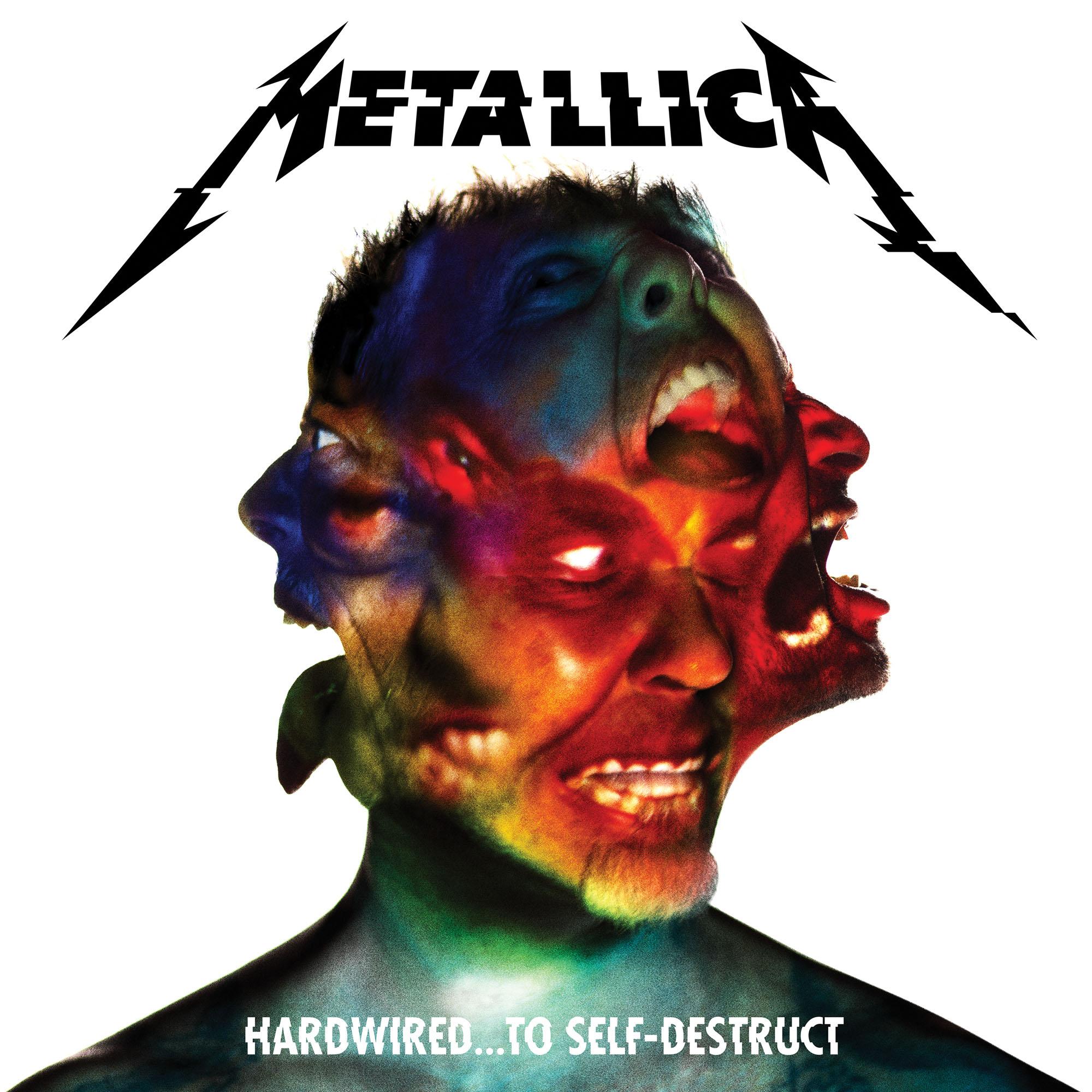
Hardwired… To Self-Destruct (2016)
The Hardwired… art is so weird that even Metallica are confused by it. It’s a composite of the four members’ faces, designed by studio Herring & Herring after they made something similar as a wedding present for Lars Ulrich in 2015. Bassist Rob Trujillo told Corey Taylor in 2016: “When we were in Central America, there were these massive posters of that image. James goes, ‘Look, it’s your face.’ I go, ‘No, that’s not my face.’ ‘Well, that’s your eyebrow – wait a minute, that’s Kirk’s nose. That’s your tooth.’” Kirk Hammett added: “I know that’s my tongue. That’s all I know for sure is me.”
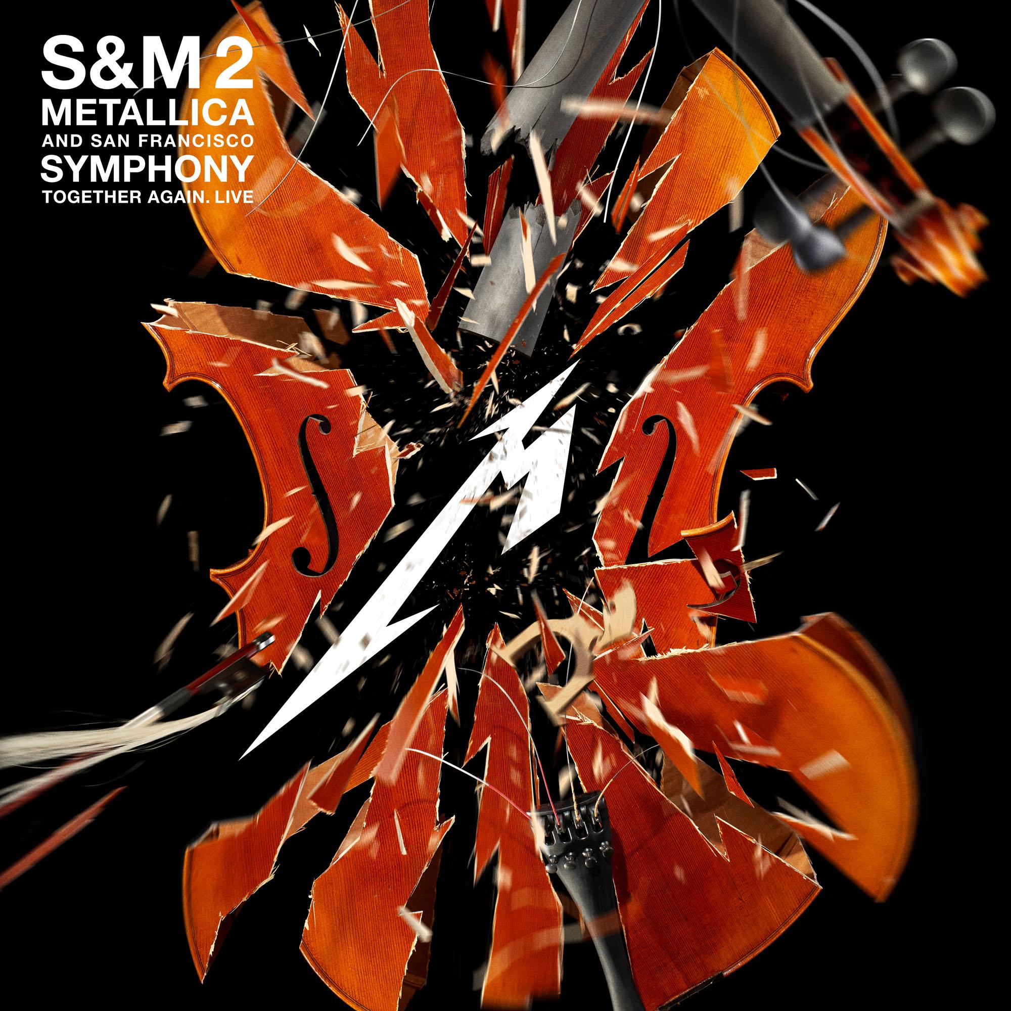
S&M2 (2020)
When Metallica decided to reunite with the San Francisco Symphony for a 20th anniversary celebration of S&M, they pulled out all the stops, taking over the Chase Center for two fabulous nights of symphonic metal majesty in September 2019. The accompanying S&M2 release, which came a year later, featured an exploding violin - something which photographer Stan Musilek made happen in real life courtesy of some "microdosed amounts of explosives". "The string instrument dealer was slightly puzzled why we didn't need the case," he later noted on his website.
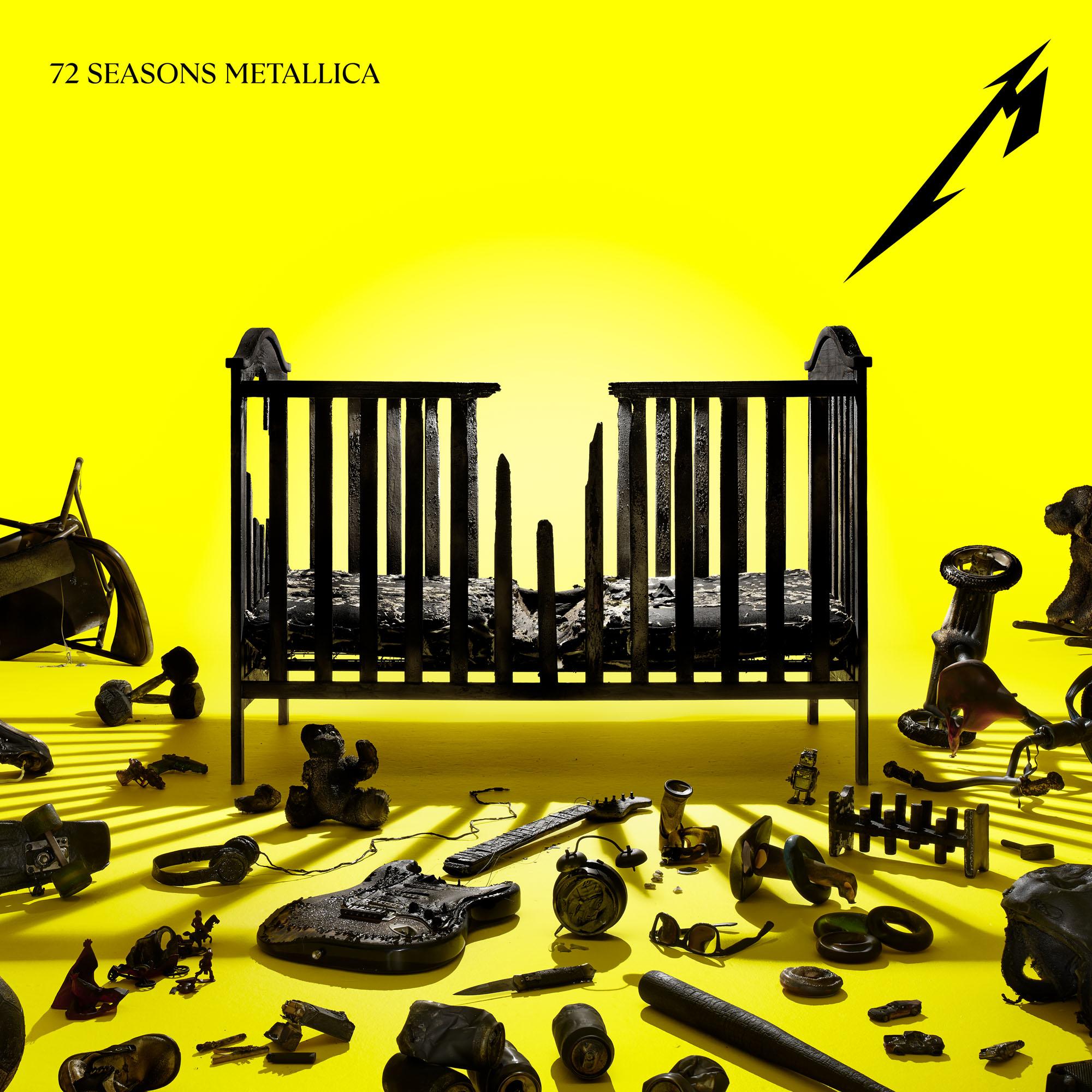
72 Seasons (2023)
According to James Hetfield, 72 Seasons is about “the first 18 years of our lives that form our true or false selves”. Musically, it looks set to be a throwback to the punk and new wave of British heavy metal influences that inspired the band growing up and leading into Kill ’Em All. So, what would be more fitting than a photo of a cot surrounded by all manner of childhood and heavy metal paraphernalia? Guitars, headphones, skateboards, toys and, um, bullets are scattered about in front of a vibrant yellow background, in a scene again designed by Death Magnetic and Lulu’s Turner Duckworth team.

Louder’s resident Gojira obsessive was still at uni when he joined the team in 2017. Since then, Matt’s become a regular in Metal Hammer and Prog, at his happiest when interviewing the most forward-thinking artists heavy music can muster. He’s got bylines in The Guardian, The Telegraph, The Independent, NME and many others, too. When he’s not writing, you’ll probably find him skydiving, scuba diving or coasteering.
- Merlin AldersladeExecutive Editor, Louder

