
 Louder AAA


The most iconic artworks on a 12-inch canvas.
King Crimson
In The Court Of The Crimson King (1969, by Barry Godber)
If album covers are the poor man’s art collection, then Barry Godber’s painting is the equivalent of Munch’s The Scream. It’s an ideal complement to single 21st Century Schizoid Man, and a comment on the end of the 60s dream.

Led Zeppelin
III (1970, by Zacron)
Zeppelin’s most evocative record was also their best dressed. III came wrapped in a spinning-wheel cover modelled on an old crop-rotation chart and had two Aleister Crowley quotations etched into the inner vinyl groove. A devilish reference, then, but God was in the detail.

Uriah Heep
Look At Yourself (1971, by Douglas Maxwell Ltd)
The cover of Uriah Heep’s third album reflected (ouch!) their status as a band of the people. Instead of featuring an image of the group themselves, it used foil as a makeshift mirror, inviting purchasers to gaze at their own image while savouring the likes of July Morning et al.

**Hawkwind **
_Space Ritual _ (1973, by Barney Bubbles)
Barney Bubbles’ design was an artistic landmark. Both the outer and inner sleeves folded out, revealing photos and illustrations connected to Hawkwind’s stage show. This was so intricate, detailed and exotic, it perfectly reflected the music. Or maybe vice versa?

**Peter Gabriel **
Peter Gabriel (1980, by Hipgnosis)
Who is Peter Gabriel? Burglar, assassin, soldier. As the disintegrating portrait suggests, the Slipperman shed the last remnants of his prog past while trying on new – and new wave –masks. _‘I got no memory of anything,’ he sings on I Don’t Remember._

Phil Baines, Professor of Typography, and Dave Hendley, Associate Lecturer in Photography & Context at London’s Central Saint Martins, University Of The Arts, critique some classic covers.
Big Brother & The Holding Company
Cheap Thrills (1967, by Robert Crumb)
“An extraordinary cover, striking in its composition from afar, but full of detail and devilment close up. Crumb’s cover art and the band’s music are both mocking of so many stereotypes and in that they are a perfect match for each other, but it is doubtful whether his exaggerated gender and racial depictions would be tolerated today.”

**The Velvet Underground & Nico **
The Velvet Underground & Nico (1967, by Andy Warhol)
“An example of a band’s vision and a record label’s nervousness. An unknown group release an LP with a cover that is unashamedly an art piece, made and signed by avant-garde artist Andy Warhol, and which omits both their name and the album’s title. The image, in the hard-edged style for which he was by then known, was printed on a removable film with an invitation to ‘peel off and see’ the flesh-coloured image beneath! The reverse is a straightforward composition of type and image: if uninspired, it at least helps the uninitiated.”

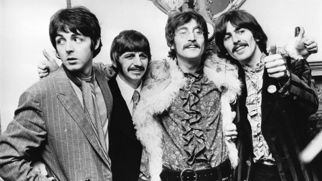
**The Beatles **
The Beatles (aka the White Album, 1968, by Richard Hamilton)
“After releasing Sgt Pepper, The Beatles could do anything, so they brought out a completely different kind of album, with a cover unlike anything before. Designed by pop artist and cultural magpie Richard Hamilton, the title is the band’s name embossed on a white, top-hinged ‘gatefold’ cover. When opened, it reveals an almost modernist layout of typography and portraits, and included a free poster featuring a photographic montage. The original release was of numbered copies, creating, as Hamilton said, ‘The ironic situation of a numbered edition of something like five million copies.’ The photographs are interesting too, hinting slightly towards the troubled images from Let It Be a year later. Daring, well-executed and perhaps the last LP to be so obscurest about its identity until Peter Saville’s Power, Corruption & Lies for New Order in 1982.

Jethro Tull
Aqualung (1971, by Burton Silverman)
“The image relates closely to the album’s themes and, being unattractive, is a brave image for an LP cover. The image is a painting of a homeless man by Burton Silverman, based on a photograph by Ian Anderson’s wife Jennie. Views about using images of the homeless have changed over the intervening years and this approach, however rooted in the subject matter, would probably be felt to be exploitative today. We actually differ in opinion about the use of type on the cover: one of us thinks that it fits the image well, the other that it sits uncomfortably!”

ELP
Brain Salad Surgery (1973, by HR Giger)
“1970s rock groups vied with each other over everything: biggest light shows, longest tracks… and album covers. ELP commissioned surrealist painter HR Giger to create this cover that neatly incorporates two images within an open gatefold. It looks meaningful but is a schoolboy phallic fantasy, and parts of the original artwork had to be removed! Giger was also responsible for creating the monogram of the band’s initials in the lower part of the sleeve, which they subsequently used on its own. Giger went on to create the eponymous creature in Ridley Scott’s movie Alien and should perhaps be remembered for that instead.”


