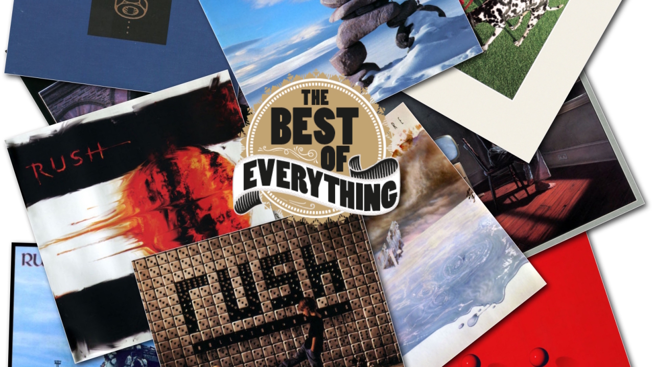
The 11 best Rush album covers by band Art Director, Hugh Syme
The best of everything, every day on TeamRock.com
Select the newsletters you’d like to receive. Then, add your email to sign up.
You are now subscribed
Your newsletter sign-up was successful
Want to add more newsletters?
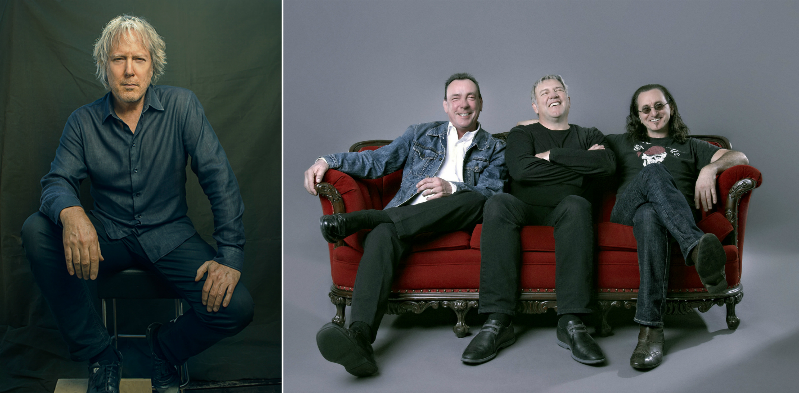
Hugh Syme has worked alongside Neil Peart and Rush to create their album artwork since 1975 ’s Caress Of Steel.
Not only did he create the band’s classic Starman logo for their 1976 follow-up 2112, he also took time out to play the ARP Odyssey on the album’s timeless intro and washes of mellotron on Tears. Still an integral part of the extended Rush family, we asked him to pick the 10 best sleeves he’s created for the band. Being Hugh, he came up with 11.
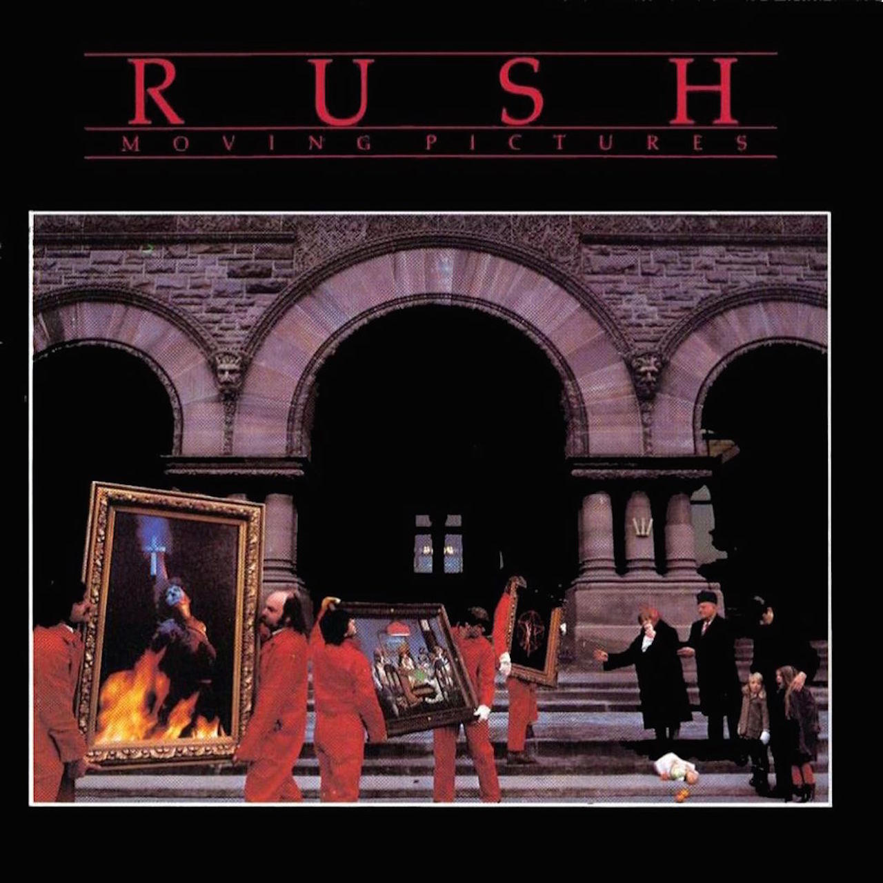
1. MOVING PICTURES (1981)
Despite budgetary limitations, for that time, and the challenges this concept posed… this was a pretty ambitious piece to undertake — from the cover to the inner-sleeve. I’m pleased that the outcome was so close to my initial vision. And, like some songs — this one came to me in an instant. Neil’s titles are like that. They inspire images and I have always been spoiled with his being the consummate wordsmith that he is. His wonderful titles were always eagerly anticipated by this art director. They were the point of departure for every album we did. I also came to discover, and delight in, a realization that these guys were into puns. Simple, elaborate, profound or glib. And, they knew how to let our visuals afford humor and mystery.
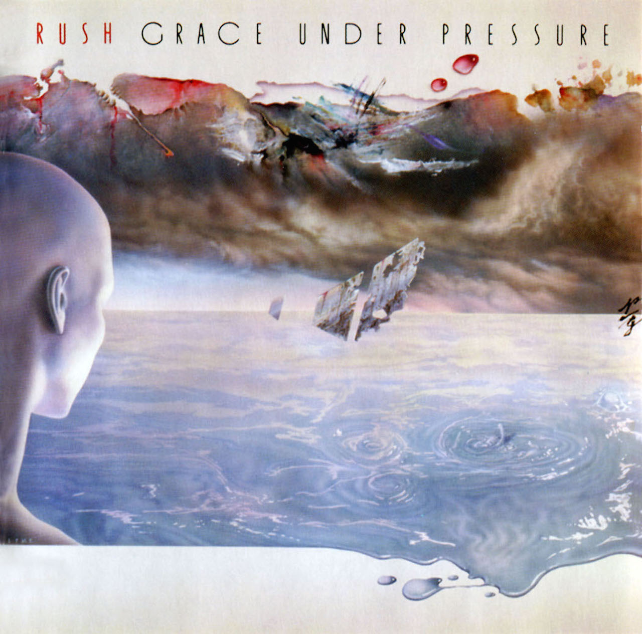
2. GRACE UNDER PRESSURE (1984)
By now, we had really hit our stride as band and art director. I was really enjoying the process of how Neil and I could discuss, and jam on ideas. Sometimes with immediate yields, and sometimes only finding the first of many. My initial inclination was to venture into an ultra minimal, almost ECM jazz label feel (I was listening to a lot of Keith Jarrett at that time), and in that cover’s frame, depict a field of a heavy tone over a calmer hue, so we would have pressure weighing down on grace. Sky and water. That’s when it occurred to me that this could also be a fraction with p/g (literally “p” over “g”). Then, as the evening and the Armagnac took effect, we found ourselves heading into a more metaphorical, surreal direction for the final themes of the painting. I also enjoyed that process … painting. Something we only ventured into a few times hence. I still have the working sketch that I did that evening on a paper napkin.
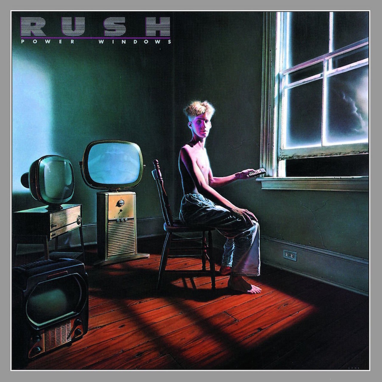
3. POWER WINDOWS (1985)
Again, good to be painting this vision for the band’s cover. Also, a turbulent time for me, in many ways — then, losing my father in the midst of that project. This made for a truly cathartic need for me to go deeper into something, other than myself. So, that painting was my sanctuary, lasting the better part of eight weeks. Between my work, and the camaraderie of my good friend and master photographer, Dimo Safari, those can now be recalled as the best of times.
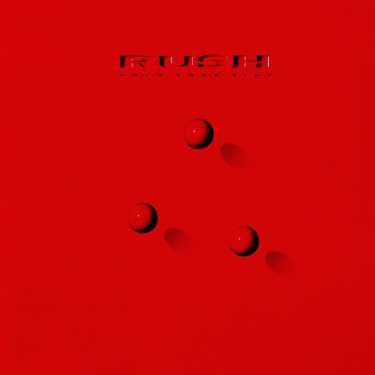
4. HOLD YOUR FIRE (1987)
I liked that the band could willingly dare to weave in and out of the graphically simplistic, to the more extravagant productions. This project had both. The stark red cover set up the icon for the entire campaign with the configuration of red spheres, whose formation was then rendered through photography, illustration, and miniature sets on the inner spread. A fun and ambitious undertaking.
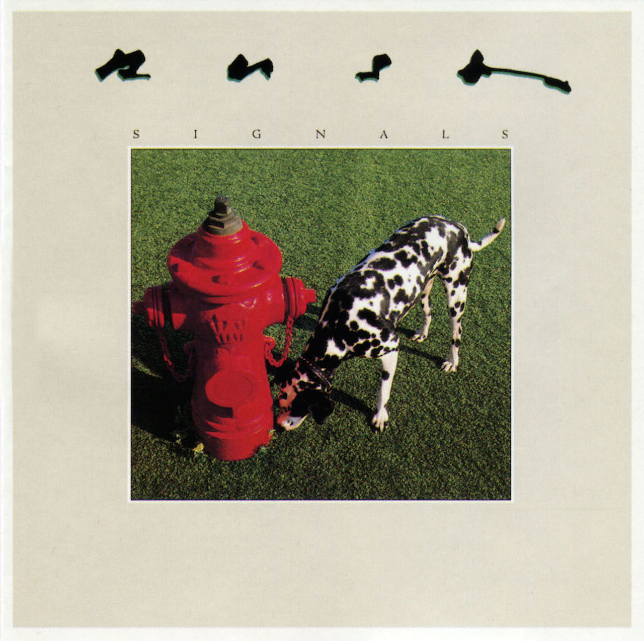
5. SIGNALS (1982)
The fire hydrant and the firedog. This deceptively simple end result of an otherwise everyday occurrence in the dog world was the culmination of three months of conceptual cul-de-sacs. I like how graphically the primary and secondary colors worked, while depicting the theme with some still unsettling and unexpected whimsy. A moment from Twin Peaks.
Sign up below to get the latest from Classic Rock, plus exclusive special offers, direct to your inbox!
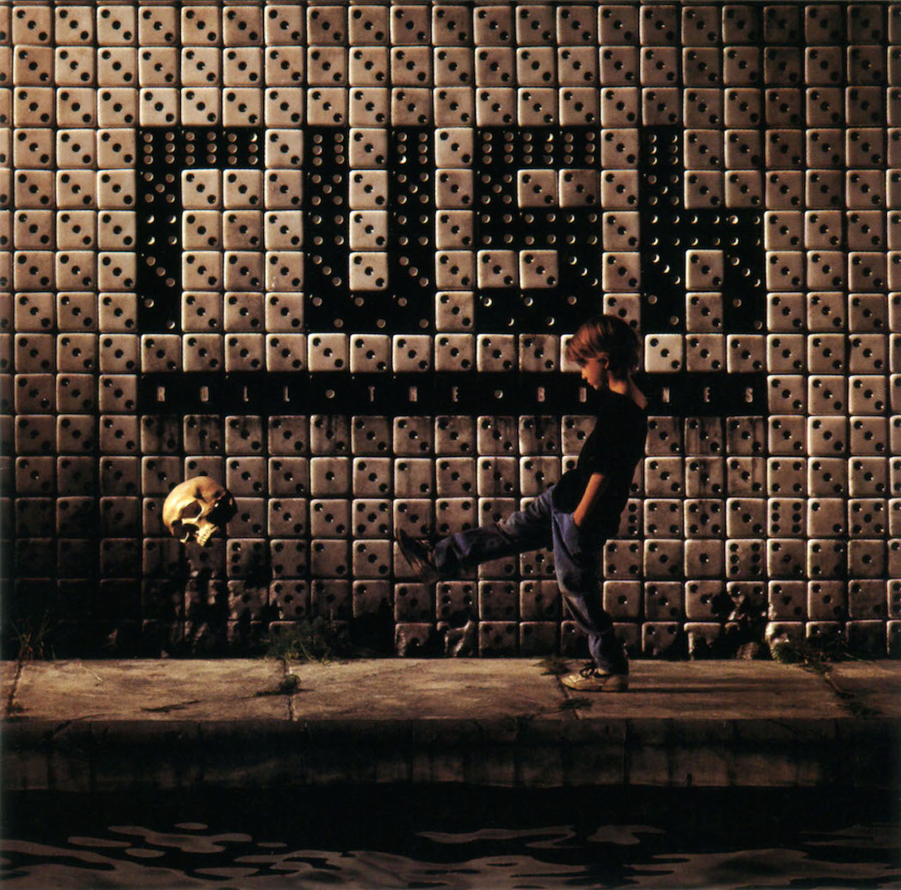
6. ROLL THE BONES (1991)
Big project. Big production. I have always enjoyed the outcome of combining our full scale set of the foreground water, the boy and subway platform … with the miniature wall of dice as the subway tiles. And, this was the genesis of a digital technology where I could move away from traditional retouching with bleach and dyes on a dye-transfer print, combining disparate images that would be composited into a final (and improbable) image on a singular print … to where I could achieve all that ‘in the post’ with photo manipulation in Photoshop—all within the digital realm. Command-Z means never having to say you’re sorry.
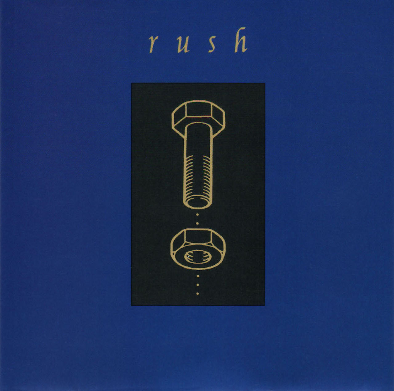
7. COUNTERPARTS (1993)
What band in all of rock and roll would allow their art director to propose (with a straight face) a diagram of a nut and a bolt for such a potentially vast word as ‘counterparts’? So vast a word, that Neil and I could not stop thinking big. So we didn’t… for weeks and weeks!
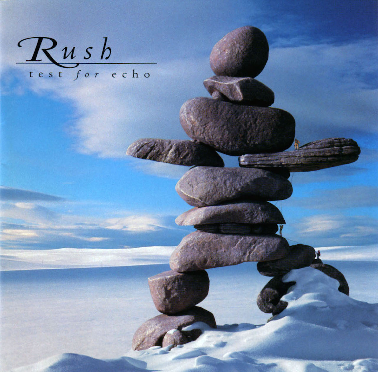
8. TEST FOR ECHO (1996)
This was the first time we approached the ‘album’ for what the CD package really offered and inspired. Rather then bemoaning the decreasing surface area of the 12” LP to the CD booklet cover, we knew to keep the art more iconographic and suitable for the 4.75” square. We also embraced the opportunity to populate the inner panels of the book with new art for each song’s particular theme. Covers within covers. An adjustment, certainly … but newer and different ways of thinking for enhancing the viewer’s experience.
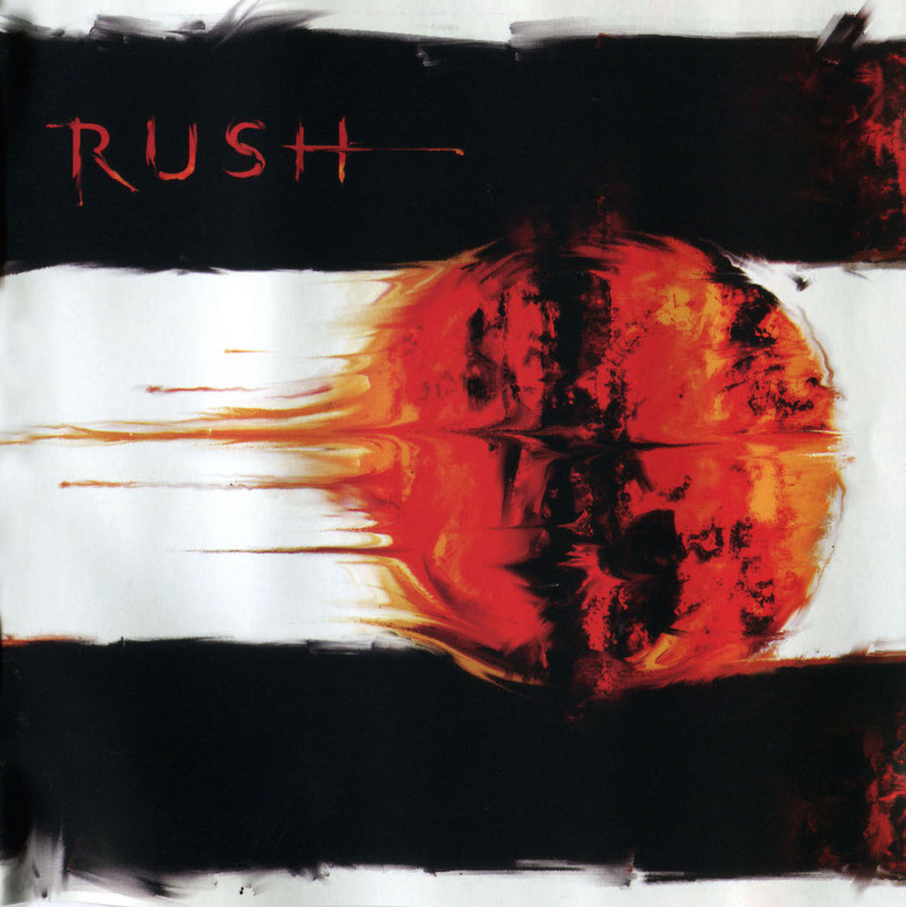
9. VAPOR TRAILS (2002)
A culmination of years of silence and healing. But a wonderful thing to be collaborating again with Neil after five years. I loved how his explanation of Vapor Trails speaks to the flash of light that we know as our life, how life is fleeting like the comet passing above. I resisted all National Geographic or NASA photography, and felt that we should depict fleeting … with fleeting. The painting that I did on an 18” square board was done between my morning coffee and lunch. It was always intended as the “sketch” for the actual painting I had planned. Neil liked the feel of the sketch, and it was with little-to-no convincing that I fell into step with his immediate response to it. With Andrew’s portraits as reference, I worked in a more urgent and gestural style than I usually was inclined to with (say) Power Windows to complete the three portraits in less than a week. Again, fleeting.
10. CLOCKWORK ANGELS (2012)
Here, I could enjoy a sizable deviation from our norm (though to Rush’s credit, unlike so many other artists, they always planned well ahead — allowing at least six months for each project to unfold). Thanks to the extension of the Time Machine tour for a second leg in Europe, and the fact that they only had two songs completed for this ‘work-in-progress’, I was able to begin work early on, and continue for a full 22 months in preparing the art for this epic saga from Neil. As the songs were completed and the lyrics were released, we were working pretty much in concert while they were writing, rehearsing and recording … I was developing each illustration for the album. My file for this project remains unchanged as the original working title contender Steampunk Serenade. Some things never change.
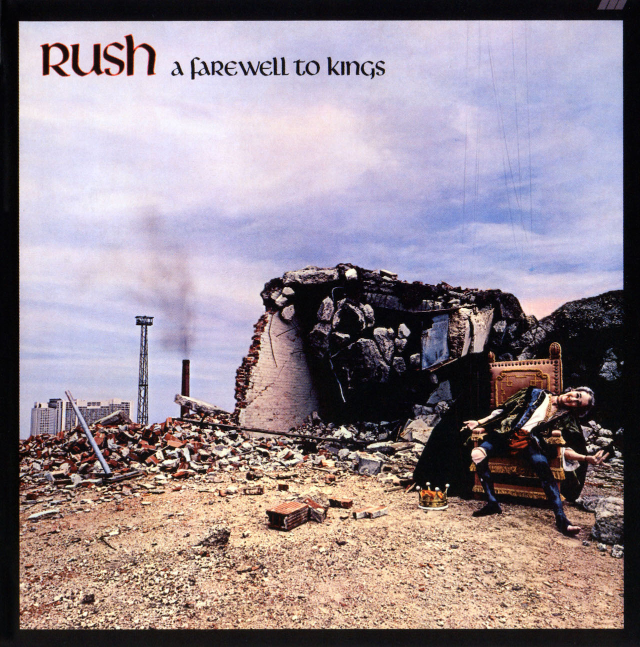
Oh, and I always liked (1977’s) A FAREWELL TO KINGS, too. (11)

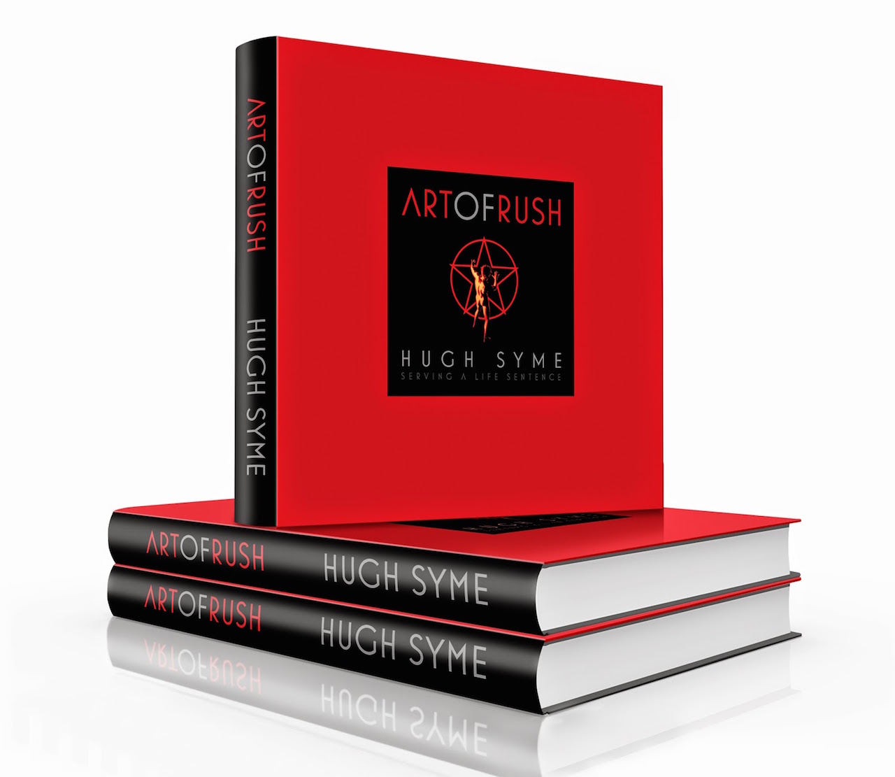
Hugh Syme’s Art Of Rush book is available from RushBackstage.com.
