
 Louder AAA


Avenged Sevenfold have one of the most recognised logos in modern heavy metal: the Deathbat. The icon’s appeared on countless t-shirts since the band formed in 1999, but it’s also just the beginning when it comes to their visual story. Now responsible for eight albums and one live/b-sides compilation, the Huntington Beach hellraisers have worked with some of their genre’s most gifted and renowned artists. To celebrate their aesthetic journey, and the impending release of Life Is But A Dream…, here are the tales behind why every Avenged release looks the way it does.


Sounding The Seventh Trumpet (2001)
Avenged Sevenfold’s name was taken from the story of Cain and Abel, so the band decided to double down on the biblical references for their debut album. Sounding The Seventh Trumpet’s title alludes to chapter 11 of the Book Of Revelation, which predicts that seven angels blowing trumpets will be the harbinger of the end of the world. For the aptly heavenly-looking artwork, Avenged tapped Santa Cruz-based tattooist Adam Barton. The artist had history with the band even in those early days, as he’d previously inked M. Shadows. Congrats on the repeat gig, Adam!

Waking The Fallen (2003)
The Deathbat logo emblazoned on Avenged’s breakthrough album, Waking The Fallen, was originally designed by a high school friend called Micah Montague. “We realised really early that we needed a logo,” M. Shadows told Revolver in 2010. “We got our friend Mike to draw it and we gave him 20 bucks, and he drew the Deathbat and it’s never changed since.” Although all versions of Waking… use that symbol as the cover nowadays, it was initially just a slipcase for the CD. The album’s booklet had a darkly majestic painting by Taylor Montague on the front of it.

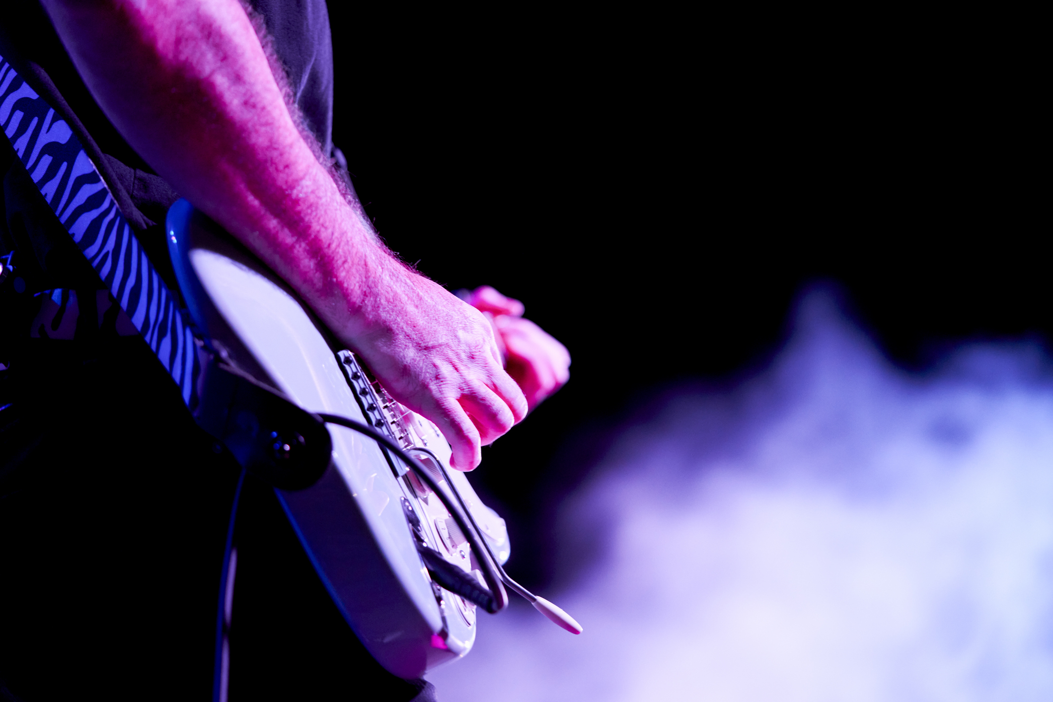
City Of Evil (2005)
Everything about Avenged got bigger and better for City Of Evil. At 72 minutes, it was by far the band’s longest album and their major label debut, getting released through Warner Bros. And it eyed a much larger audience by ditching metalcore in favour of Guns ’N’ Roses and Metallica-inspired heaviness. Graphic designer Casey Howard’s artwork perfectly symbolised the band’s new, grander ambitions: it turned the Deathbat design into a depiction of a winged demon riding a horse, leaving nothing but fire and charred landscapes in his wake.

Avenged Sevenfold (2007)
Although Avenged Sevenfold took big risks with its symphonic, country and prog overtones, the band decided to keep the frills outside the music as basic as possible. The album’s self-titled, has no text on its front and features artwork that simply palette-swaps what everyone had already seen on Waking The Fallen. The more powerful imagery is actually in the liner notes. Casey Howard returned to create a series of black-and-white drawings that visualise the songs’ themes, with the piece that accompanies Brompton Cocktail being especially gorgeous. In a just world, it would have been the cover.

Live In The LBC & Diamonds In The Rough (2008)
As of this article’s publication, this double disc of live songs and b-sides marked the final time that Avenged collaborated with Casey Howard. However, the cover of Live In The LBC… retains the artist’s balance of anarchy and grandeur. It features skeletal caricatures of the band’s five members performing in the foreground. Behind them is a drawing of Long Beach, California, where they headlined the Rockstar Taste Of Chaos tour on April 10, 2008. The LBC Arena is still more famous for being where Iron Maiden recorded Live After Death in 1985, though.

Nightmare (2010)
Nightmare is infamously haunted by the death of The Rev, who passed away just one month into recording in December 2009. Despite much of the music being written before he died, the lion’s share of the lyrics reference and pay tribute to the fallen drummer. The album art follows suit, with its centre clearly showing a grave that has the word “foREVer” carved into it. One of the most in-demand artists in heavy metal, Travis Smith, painted the piece, somehow finding the space amid a schedule that’s included Opeth, Death, Devin Townsend and Overkill.

Hail To The King (2013)
Hail To The King was what happened when Avenged tried to create a “big” yet “barebones” heavy metal album. The fan response to such a move was fiercely polarised, but the band reached the top of the US and UK album charts in 2013, so it paid dividends. The artwork complemented the album’s musical shift, simply filling up both the front and back cover with a Deathbat against a black background. Tragically, it marked the last time that the logo’s originator, Micah Montague, would see his design on an album cover, as he died in 2016.

The Stage (2016)
The Stage’s lyrics are a scientific analysis of the present and future of Earth, exploring everything from AI to religion. As a result, the artwork is a cosmic piece with our pale blue dot at its centre, surrounded by lightning and green fog. However, it’s also subtly referencing the Deathbat. Look closely and the fog forms a skull shape, with the forks of lightning at either side resembling wings. It’s a cool nod from mysterious design studio Butcher & Baker Workshop, which we’re assuming is at least half composed of Zacky Vengeance (real name Zachary Baker).

Life Is But A Dream… (2023)
Avenged went all in with minimalist artist Wes Lang for Life Is But A Dream…. Not only did he paint the album cover, but he was also in charge of masterminding an all-new Deathbat. According to the band, the resulting work, which entirely consists of black paint on a beige background, “encapsulated our [album’s] theme of existentialism through visual art”. The lyrics were inspired by the philosophy of Albert Camus, who was anti-Christian and believed life to be devoid of meaning, so Wes’s bleak style should prove to be perfect imagery.
Life is But A Dream… is out on June 2 via Warner.

